Baxter: IQ Enterprise Application Refresh
Summary
Project Overview
Baxter is trying to move more into software design and management tools, one of the primary software applications is IQ Enterprise, or IQE for short. The idea for IQE was to make it a hospital/clinic management tool. A place where a nurse could monitor patients, clinicians can connect medical devices to patients or even IT departments load their network hotspots so a device can be moved throughout a building and always be connected. It is a robust tool.
IQE was initially designed by a third party agency before I started at Baxter. The original designs were impressive but the product team made many changes to the designs after the contract with the third party agency had wrapped up. These changes happened during the development phase and there were no records of the changes or why they happened. This was where I came in on the project.
While working with the product and development teams I realized no one was doing any QA work on the development builds. In fact, Baxter did not have a QA process for the design side of a front end build. This was a problem that needed to be fixed so I introduced an audit process. I went through the builds, took screen shots and pointed out all the issues I could find. I then met with development and product to determine what were high priorities to be fixed.
The audit process was mostly well received. The product and development teams recognized the value of having screens that looked nicer. However, the project managers were a little less than thrilled as the audits would slow down progress because it forced the developers to redo a lot of their work. The frustration from project management lead to a pm “challenging” me to redesign the application to make it look better but to still follow what the development team was doing. This happened a week before Thanksgiving and I had plans to travel 3 weeks later for the Christmas holidays. I had to update designs on over 40 screens in less than 18 days or a team of 10 developers wouldn’t have anything to while I was gone. No pressure.
I managed to complete the work with a day to spare, thankfully everyone was onboard with my updates and they were implemented by the development team flawlessly.
Client
Baxter
Services
- Customer Research
- User Experience Design
- User Interface Design
- Visual Design
Tools
- Figma
Process
Audit
The audit process I created was a way to look at the work the developers did and try to help correct their mistakes. The team I was working with were backend developers who were transitioning to front end. It wasn’t that they didn’t have skills, they were still learning. When I presented the issues to them I was respectful and made certain I did my best to not make any of them look bad.
Audit Elements
Design
The designs were an interesting challenge. It was my goal to try make sure the changes were CSS based and not really structural. This meant I would be able to follow what currently existed but but make the work for the developers as easy as possible.
When it was time to show my work I put together a comparison presentation. I wanted to compare the original builds against the ideas I had put together. I thought if the team could see what previously existed and what I was proposing that would help to “sell” my ideas and make sure the different teams recognized why the effort was so important. (The figma link in the first screen does not work as it is in Baxter’s internal network).
Design Elements
Outcomes
Visual Designs
Home Screen
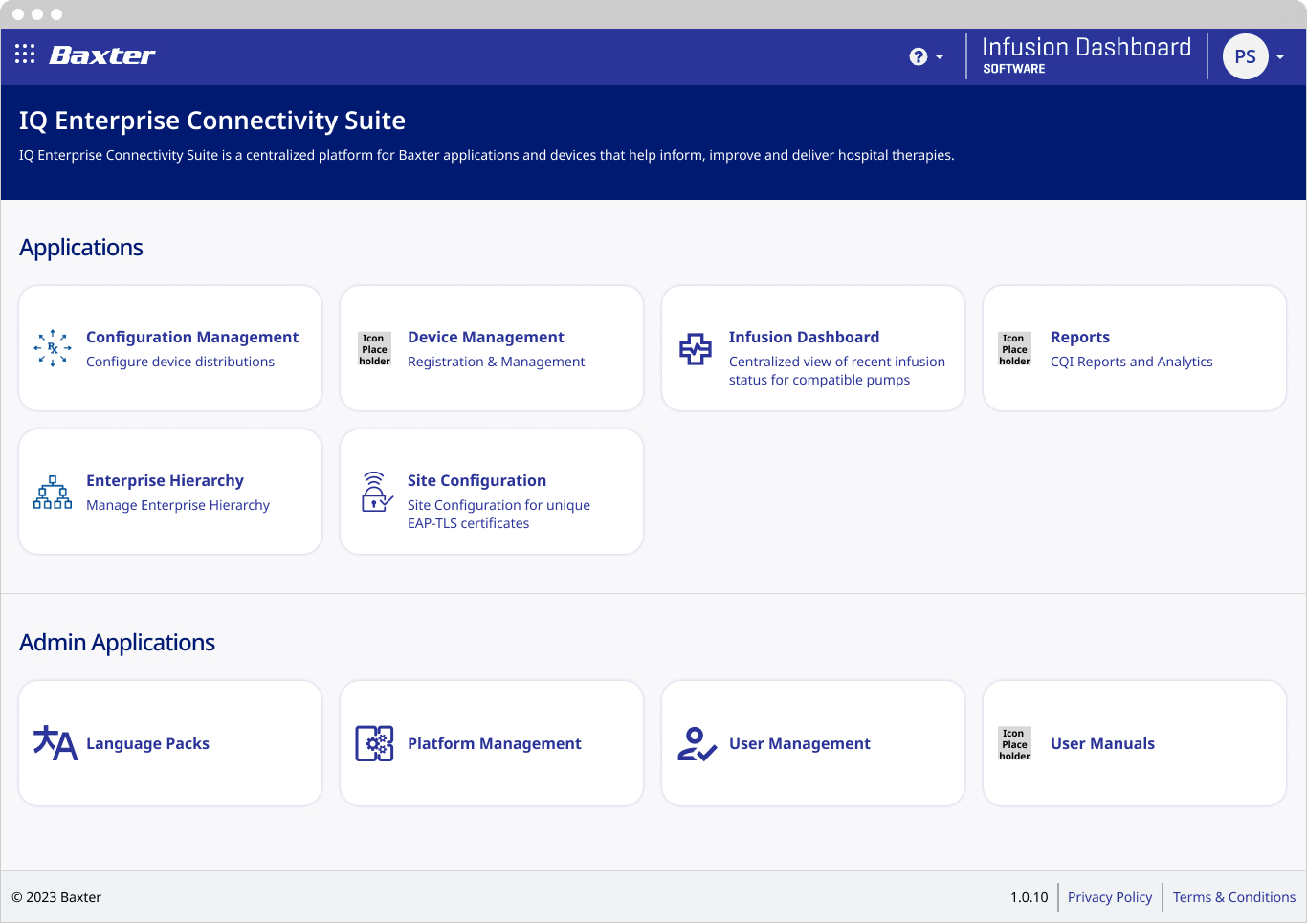
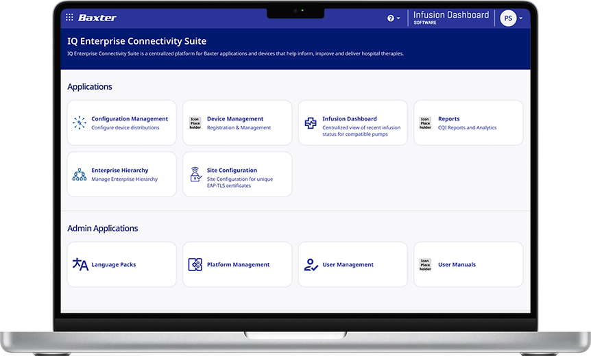
The home screen for any application is the first real interaction a user will have (other than the login). It needs to be clean and easy to use. IQE’s home screen was never meant to be a dashboard, but a place to choose which application a user would like to navigate to. I tried to modernize it within the constraints of the brand guidelines
Hamburger Menu
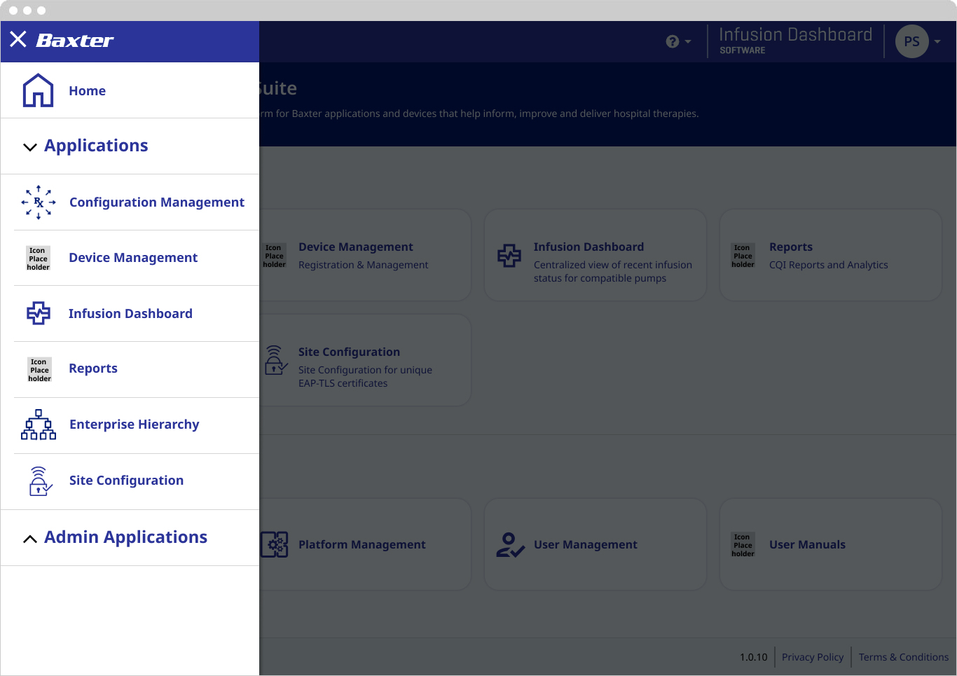
I used my previous mobile app experience when approaching the hamburger menu. I wanted to make sure there was a clear hierarchy. I added a more clearly defined accordion system and dividing lines between each button to make it clearer these were individual links.
Device Management
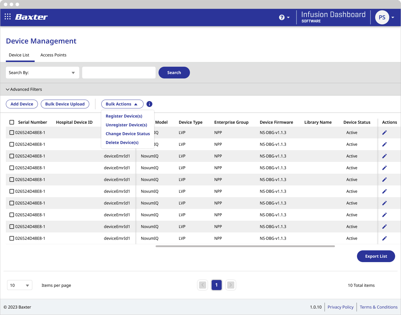
In the original device management screen all the table actions were controlled by a single 3 dot overflow menu between the “Serial Number” column header and the select all check box. This was very difficult for the user to discover and it wasn’t clear when an action was row specific or a bulk action.
I broke up the actions into a few different buttons the user had available to them at all times. The buttons over the table allow the user to perform actions at any time. The Bulk Actions are available when a user selects table rows. Edit is always available at the row level.
Infusion Dashboard
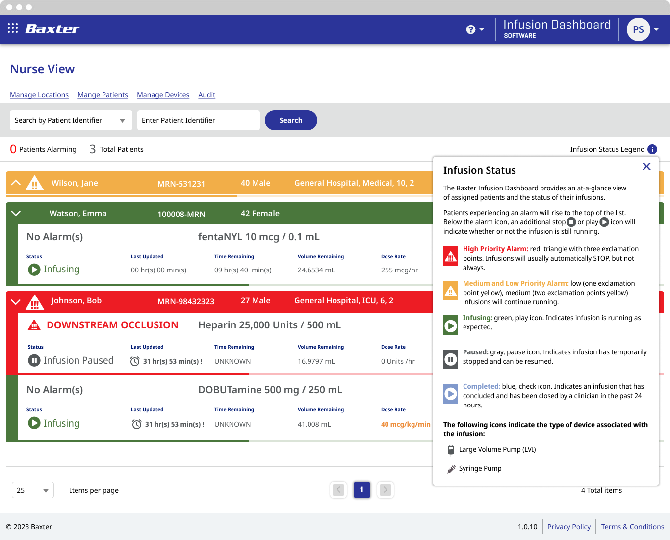
The infusion dashboard was set up so nurses could monitor multiple patients from their stations in the ICU. This view includes the Status Legend, a description of the different icons on the dashboard.
Reports: Infusion View
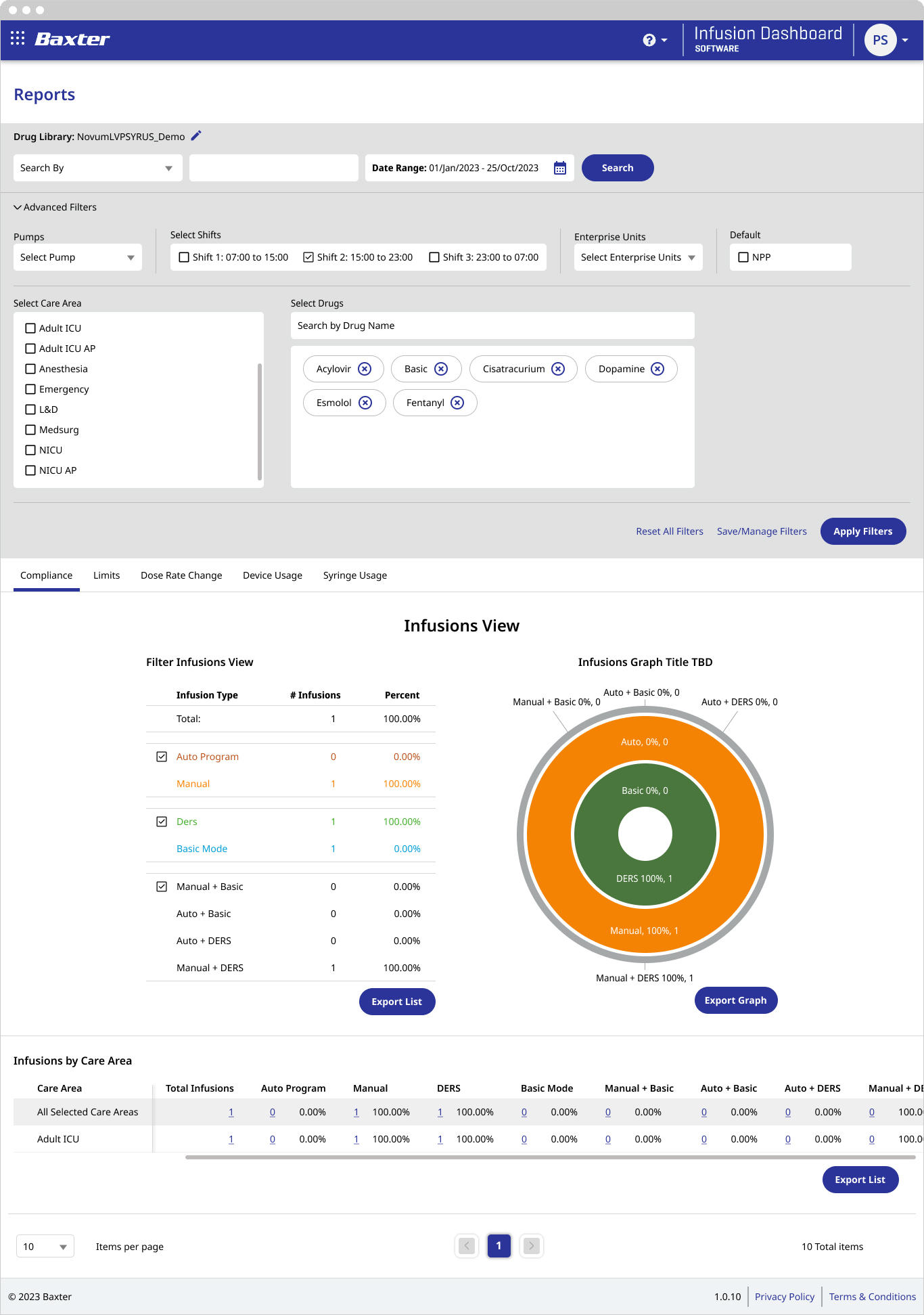
Reports are an important part of IQE as they help track patient health. The filters on the reports were originally very difficult to follow. My goal was to streamline and simplify how a user filtered their reports to make it easier to use.
The donut chart is a “cool” element on the screen and presents useful data. However, the users were not aware the table on the left controlled the view of the chart on the right. I tried to make it a little more obvious by matching the font colors to the chart colors and adding checkboxes so the user could know they were turning something on and off.
Reports: Syring Useage
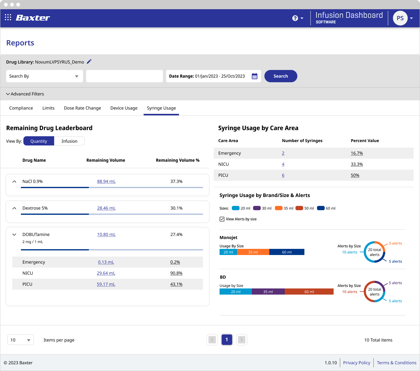
This screen doesn’t have a background story like the rest. I rearranged the data and added expand/collapse functionality. I included it because I thought the final results just looked good.
