Modernized Mobile App Navigation

Project Overview
Summary
The Viewpoint Teams Mobile App had a navigation problem. Field workers on construction sites had to tap through multiple landing pages to reach the sections they needed, and the hamburger menu was so underutilized it was effectively invisible to users.
I redesigned the navigation from the ground up, conducting workshops, usability tests, and a field study at an active construction site in Nashville to validate the changes. The result was a restructured hamburger menu, a new Favorites area in the bottom tray, and a significantly reduced tap count to reach any key screen in the app.
Problem to Solve
Construction workers use the Teams app in the field, often with dirty hands, time pressure, and limited attention to spare. Every extra tap to find a screen is friction they don’t have time for. The existing navigation required users to pass through multiple intermediate landing pages to reach specific sections, and the hamburger menu was cluttered and disorganized, making it faster to scroll than to navigate.
The deeper problem was structural. The app had no distinction between actions that belonged to the whole app and actions that belonged to a specific project. Everything lived in the same navigation, which meant users had to mentally filter the menu every time they needed something, rather than the app doing that filtering for them.
Process
Discovery
I invested heavily in research before touching any designs, combining multiple methods to understand both the product and the users.
I began by learning the product thoroughly and studying mobile navigation best practices. One concept that directly shaped the final solution was the magic thumb zone, the area of a phone screen most naturally reachable with one hand. Most mobile navigation fails because it ignores how people physically hold their phones. Understanding this principle informed where the Favorites area ended up in the final design.
I also spoke with field users to understand their specific pain points, identifying the most common tasks they struggled to reach and the workarounds they had developed to navigate around the app’s limitations.
Design
With research complete I focused on restructuring the navigation around a clear distinction: global actions that belong to the whole app, and project-based actions that belong to a specific job.
Global navigation, including Notifications, Assigned to Me, and Settings, lives in the hamburger menu and is accessible from anywhere in the app. Project-based navigation, including Submittals, RFIs, and Issues, lives inside individual projects. Users always know whether they are acting on the whole app or a specific job, without having to think about it.
Hamburger Menu Before

The original hamburger menu mixed global and project-based options without distinction, forcing users to mentally filter every time they needed to navigate.
Hamburger After

The redesigned menu separates global and project-based options clearly. Global items handle app-wide actions, project-based items handle job-specific navigation. The scope of every action is immediately obvious.
The original bottom tray navigation was repurposed as a Favorites area, placed in the magic thumb zone for one-tap access to the four most-used screens.
Bottom Favorites in Magic Thumb Zone

The Favorites area sits exactly where the thumb naturally rests, giving users one-tap access to their most-used screens without opening any menu. Users can customize which four screens appear, adapting the navigation to their individual role and workflow.
Validation
To verify the changes worked I ran a structured series of usability tests. I tested via Zoom with remote participants, in person at Viewpoint’s annual user conference, and most importantly, at a construction site in Nashville where I could observe field workers using the app in the actual environment it was designed for.
Participants performed the same navigation tasks in both the original and redesigned interfaces. The field study in particular was critical, confirming that the changes held up under real working conditions and that the Favorites area in the thumb zone made a meaningful difference to how quickly users could reach the screens they needed.
Outcomes
The redesigned navigation reduced the number of taps required to reach key screens across the app. The separation of global and project-based navigation eliminated the mental filtering users had to do with every menu interaction. The Favorites area gave users one-tap access to their most-used screens from anywhere in the app, placed exactly where their thumb naturally rests.
Business Impact
The streamlined navigation made the Teams app significantly more efficient for field workers. It reduced training time, cut customer support calls related to navigation confusion, and improved users’ perception of Viewpoint as a platform that understood how they actually worked.
Client
Viewpoint
Services
- Information Architecture
- User Experience Design
Tools
- Sketch
- InVision
Test Elements
Designs
Updated Home Page
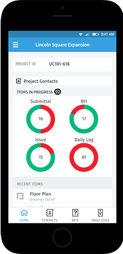
The home page was redesigned with the Favorites area placed in the bottom tray within the magic thumb zone, giving users one-tap access to their four most-used screens without opening the hamburger menu.
Set Navigation Favorites
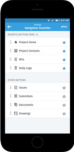
Users can select which four screens appear in their Favorites area, adapting the navigation to their individual role. Selected screens highlight with a blue star, providing immediate visual confirmation of the current configuration.
Contacts
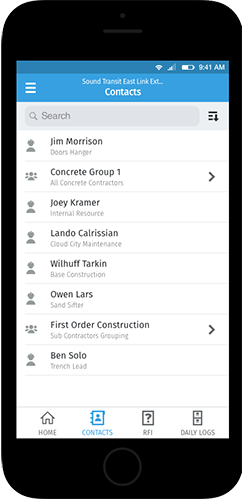
The original Contacts page had no hamburger menu or bottom tray access, leaving users stranded with no way to navigate elsewhere without backing out. The updated version restores full navigation access from every screen in the app.
Daily Logs
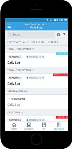
The original Daily Logs screen used the old bottom tray but had no hamburger menu, making it difficult to navigate to other sections. The updated version gives users full navigation access from within the screen, keeping them in their workflow without unnecessary back-tracking.