
Redesigning Complex Clinical Workflows

Project Overview
Summary
Sharesource was Baxter’s remote dialysis management platform, used by doctors, nurses, and clinicians across multiple countries to monitor at-home kidney dialysis patients. Despite its clinical power, the platform was difficult to use, even simple tasks took too long, and Baxter was receiving consistent complaints from clinical staff.
I was brought in to redesign the navigation and patient workflow experience. After reviewing 10 hours of recorded user research across Colombia, the UK, and Japan, I restructured the platform from a task-based model to a patient-centered one, validated the designs with two nurses with over 30 years of dialysis experience, and iterated through 8 rounds of design before reaching the final solution.
The process wasn’t traditional iterative refinement. Round 1 was blue sky, designed against the ideal patient-centered experience with no technical constraints assumed. Every round after that was a negotiation: discovering what the existing codebase could and couldn’t support, and systematically scaling back concepts that developers weren’t able to implement as designed, while protecting the core architectural shift throughout.
Problem To Solve
Sharesource let clinicians track patient progress and update dialysis devices remotely, but navigating to a patient, performing actions, and switching between patients required far too many steps. An external agency had confirmed this through user research across three countries: the platform was hard to navigate and simple tasks took too long.
The root cause was structural. The application was organized around tasks, clinicians had to navigate to a function and then find the patient they needed. In clinical reality, the workflow is the opposite. Clinicians think in terms of patients first. They need to select a patient and then perform whatever tasks are needed within that patient’s context, often across multiple patients in a single session.
Redesigning the navigation meant flipping the entire organizational model of the application.
Process
Discovery
I began by immersing myself in the platform and the research. I spent a week reviewing the external agency’s work, including 10 hours of recorded user interviews across Colombia, the UK, and Japan, before making any design decisions.
I was also paired with two nurses with over 30 years of dialysis experience each. Throughout the project they served as the clinical reality check for every design decision, ensuring that the workflows I was designing matched how clinical staff actually operated in practice.
From the research I identified two priorities: the navigation needed a complete restructure around patients rather than tasks, and clinicians needed workflow shortcuts to reduce the number of steps required to complete common actions.
Design: Round 1
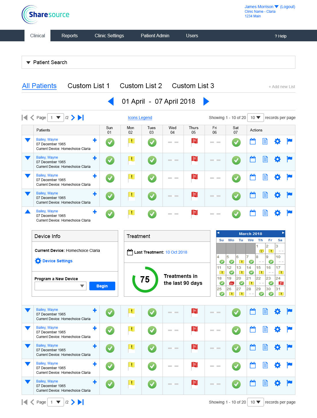
Round 1 Wireframes
The first round represented the biggest departure from the original interface, and the biggest departure from technical reality. I designed against the ideal patient-centered experience with no constraints assumed, then created detailed, annotation-heavy wireframes to clearly communicate the new concepts to the team, since this was a fundamental change to how the application worked.
Key concepts introduced in Round 1:
Custom Lists: Clinicians could create patient lists based on filters, allowing them to quickly surface the patients most relevant to their current workflow.
Expandable Table Rows: A quick-view panel that surfaced a patient’s key status without leaving the list, reducing the need to navigate into individual patient records for routine checks.
Actions Column: Quick links to the most common actions a clinician would take for each patient, accessible directly from the patient list.
Design: Round 5
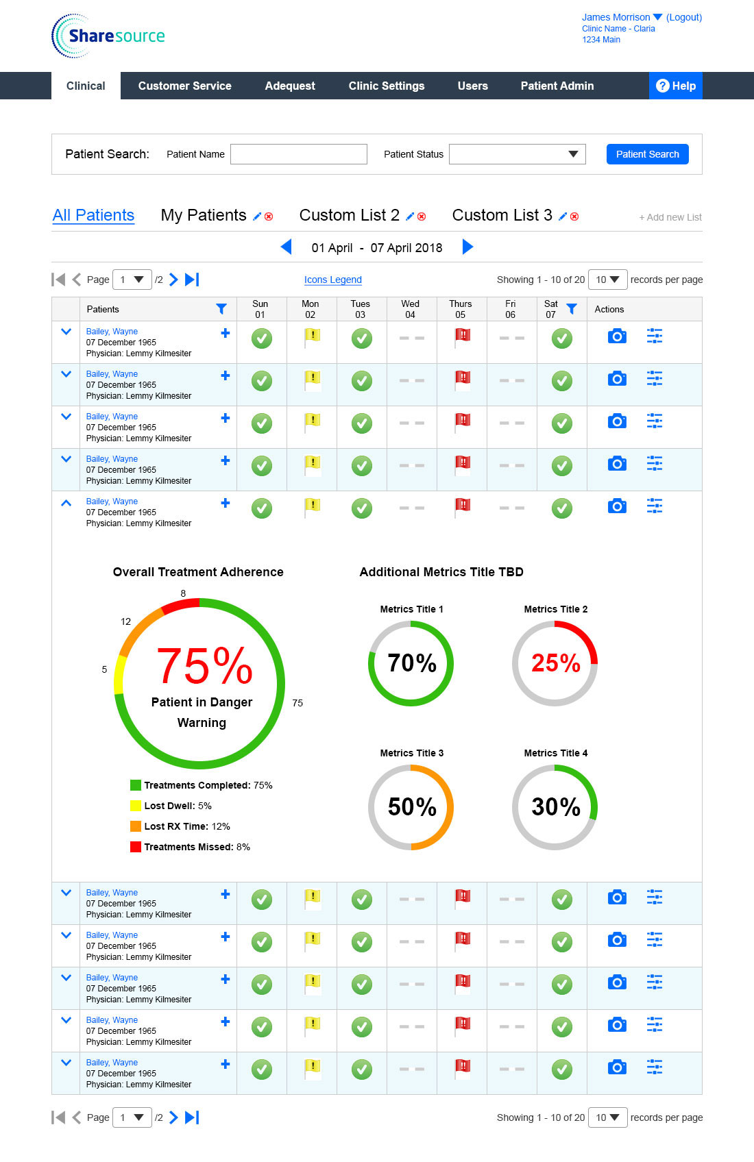
Round 5 Wireframes
By Round 5 the designs had been refined significantly through clinical validation and technical review. The core patient-centered model held, and the focus shifted to simplifying and tightening the concepts from Round 1 as developer feedback surfaced what the codebase could realistically support.
Key refinements:
Search was made an exposed, easily accessible feature rather than buried in a menu.
Custom Lists were simplified to three per user, reducing cognitive overhead while preserving the core benefit of fast patient access.
Expandable Rows were refined to surface only the most critical patient metrics.
Actions Column was reduced to fewer quick links to keep the table clean and the most important actions visible.
Design: Round 8
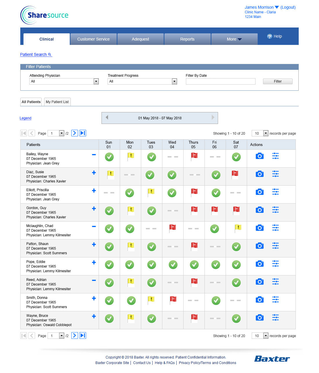
Round 8 Wireframes
The final round required further reduction as remaining technical constraints came into focus. Some of the most ambitious concepts from Round 1 had to be scaled back entirely.
Custom Lists were simplified to “All Patients” and “My Patients” rather than fully custom filters. Search could not remain an exposed feature and was replaced by a dedicated filters screen. Expandable Rows could not be implemented.
Despite these constraints the final design still represented a significant improvement over the original. The patient-centered model was intact, clinicians could now navigate within a patient’s context across multiple tasks, and the Next and Previous patient buttons preserved the multi-patient workflow efficiency that had been a core goal from the start.
Outcomes
The redesign shifted Sharesource from a task-based to a patient-centered navigation model. Clinicians could now select a patient and complete multiple tasks within that patient’s context without returning to the main list between actions. Next and Previous patient buttons allowed efficient navigation across patients in sequence, following the order of the dashboard and respecting any applied filters. The overall navigation complexity was significantly reduced across 8 rounds of clinical validation and technical negotiation.
Business Impact
Sharesource was used by clinical staff to manage patients with serious, ongoing health conditions. Every minute spent navigating a confusing interface was a minute not spent on patient care. By reducing the time required to find a patient, perform actions, and move between patients, the redesign gave clinicians more time for the work that actually mattered. The improvement in workflow efficiency and reduction in navigation friction created measurable goodwill among the clinical staff who depended on the platform daily.
Client
Baxter
Services
- Information Architecture
- Wireframes
- User Experience Design
Tools
- Sketch
Designs
Designs
Patient Dashboard
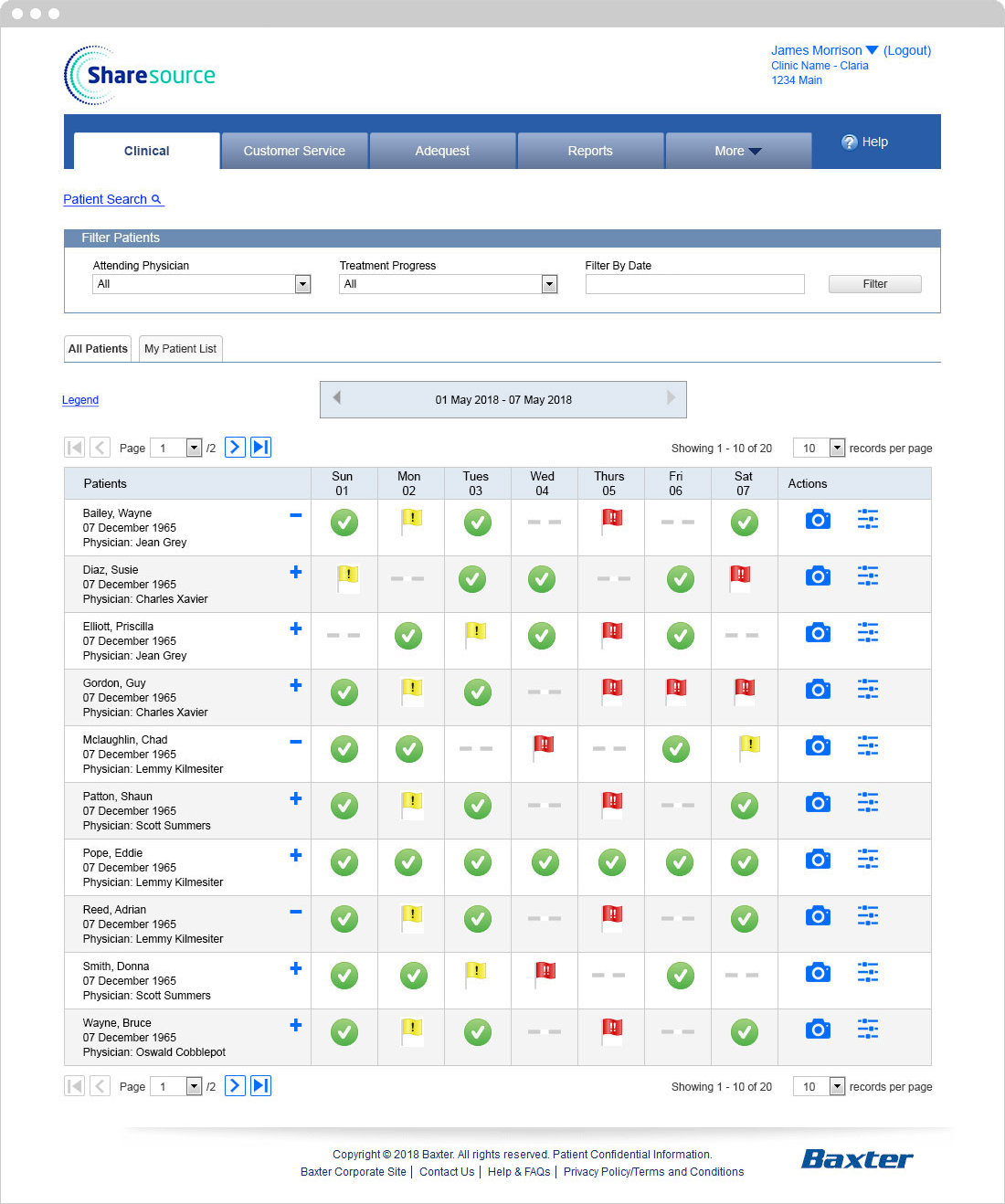
The Patient Dashboard is the central hub of Sharesource. Clinicians can see a patient’s performance across their last seven dialysis sessions at a glance, click any session for more detail, and access a patient snapshot or device settings directly from the row using icons at the end of each entry. Tabs above the list let clinicians switch instantly between their own patients and the full patient list, eliminating the excessive scrolling that had been a consistent complaint in user research.
Dashboard Filters
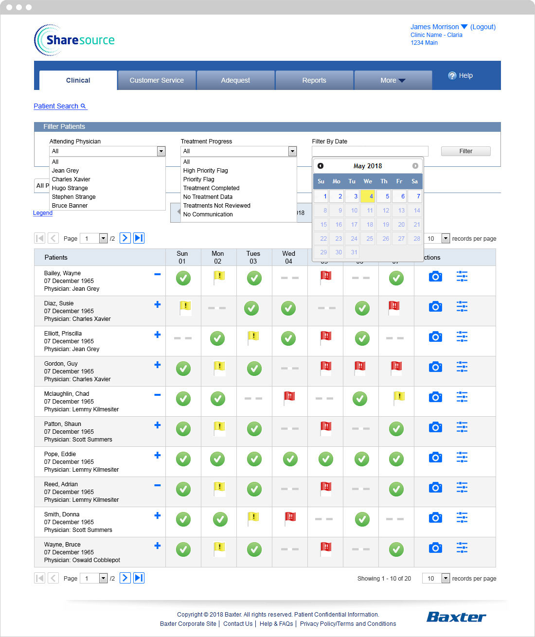
Patients can be filtered by Physician, Treatment Progress, and Date. The filters screen replaced the originally planned exposed search feature due to technical constraints, while still giving clinicians the ability to quickly surface the patients most relevant to their current workflow.
Treatment snapshot
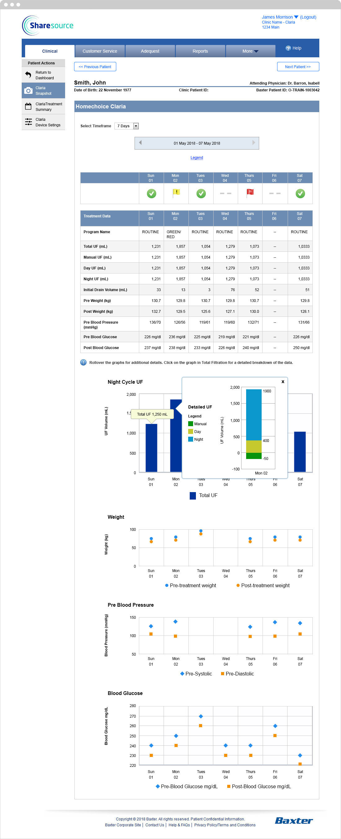
The treatment snapshot gives clinicians a clear overview of a single patient’s status. Next and Previous Patient buttons on either side of the screen allow navigation between patients in the order they appear on the dashboard, respecting any applied filters. In the original application clinicians had to return to the dashboard to select the next patient, a step that added up significantly across a busy clinical session.
Treatment Summary by the Day
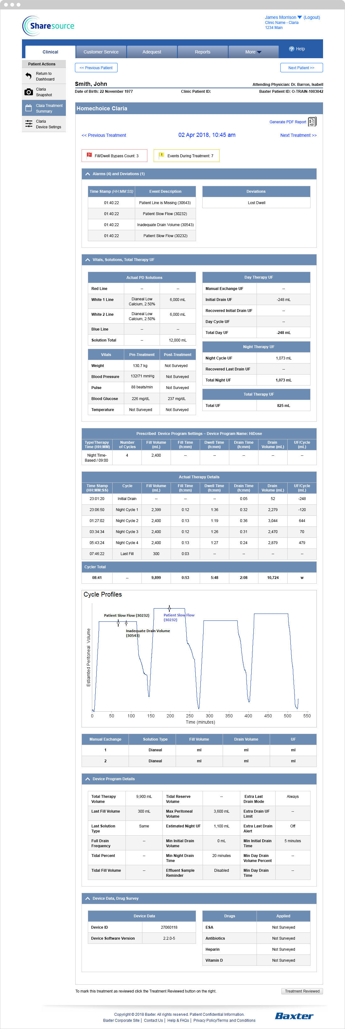
A detailed view of a patient’s treatment data broken down by individual session, giving clinicians the longitudinal context they need to track progress and identify trends over time.
Device Settings
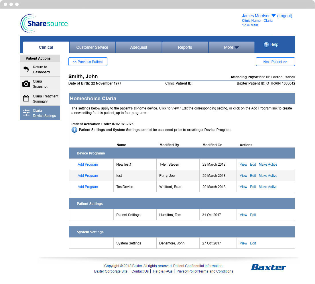
Clinicians can view and update the settings of the dialysis device a patient is using without leaving the patient’s context. Keeping device management within the patient record rather than in a separate task-based section was one of the core principles of the patient-centered redesign.