Redesigning a Restaurant Management Platform

Project Overview
Summary
As Lead UX Designer on Lighthouse Business Manager (LBM Next), I partnered with analytics and product teams to modernize a data-heavy restaurant management platform struggling to surface actionable insights. I led structured customer interviews to ground the project in real user feedback, then conducted a comprehensive UX audit, restructured the information architecture and navigation, and developed dashboard concepts and wireframes that prioritized clarity, customizable analytics, and flexible reporting workflows. The work established a strategic foundation for future visual design and helped guide the platform toward a more usable, extensible experience.
Problem to Solve
LBM (Lighthouse Business Manager) is an all-in-one restaurant management platform supporting marketing, gift cards, reservations, scheduling, sales, reporting, and short-term business loans. Despite collecting a large volume of operational and customer data, the platform was difficult to use and struggled to deliver actionable insights to operators.
I partnered with a data analyst to explore ways to improve LBM’s usability and analytics experience. This became one of the most research-intensive projects I have worked on, focused on uncovering insights to inform design decisions rather than delivering a finished product. The work involved deep analysis of both the platform and the data it surfaced, generating a foundation for future design improvements.
Process
Discovery: UX Audit
I began by onboarding to LBM to build a strong understanding of the product and its underlying complexity. From there, I conducted a comprehensive UX audit of the platform, producing a 56-slide analysis that examined every major area of the system. To make the findings more accessible to stakeholders, I distilled this work into a concise two-page executive summary.
Customer Interviews
Before making any design decisions, I led a structured series of user interviews with LBM customers to ground the project in real feedback rather than assumptions. I spoke first with product owners and the customer support team, who interact with customers daily, to build a baseline understanding and inform the interview script.
To recruit participants, I worked with Drew, a support expert with strong customer relationships, who provided a list of contacts and joined the first few minutes of each session to make introductions. Interviews were conducted over Zoom (mid-pandemic, 2021), with an analytics expert also present to explore potential dashboard improvements alongside me.
Customers often arrived with specific frustrations and were willing to speak candidly, which meant adapting the script in real time rather than following it rigidly. All sessions were recorded and notes were shared with the team. I synthesized the qualitative findings into an 11-page insights deck that was circulated internally and became a direct input for the redesign work that followed.
Key artifacts from the research process:
Defining Goals
Following research, I collaborated closely with the Head of Product and Analytics to define a clear set of goals. Our objective was to elevate LBM into a best-in-class business management tool by addressing core usability issues while unlocking the value of its existing data.
Information Architecture & Navigation
The first major design initiative focused on information architecture and navigation. Through card-sorting exercises and structural analysis, we re-evaluated the entire menu system and reorganized it to better reflect how users actually think about their work.
Our initial exploration tested a horizontal navigation model, but we ultimately shifted to a vertical structure to better support scalability and future feature growth. The final approach introduced a split navigation system: a persistent primary menu on the left for core product areas, supported by a contextual secondary menu across the top.

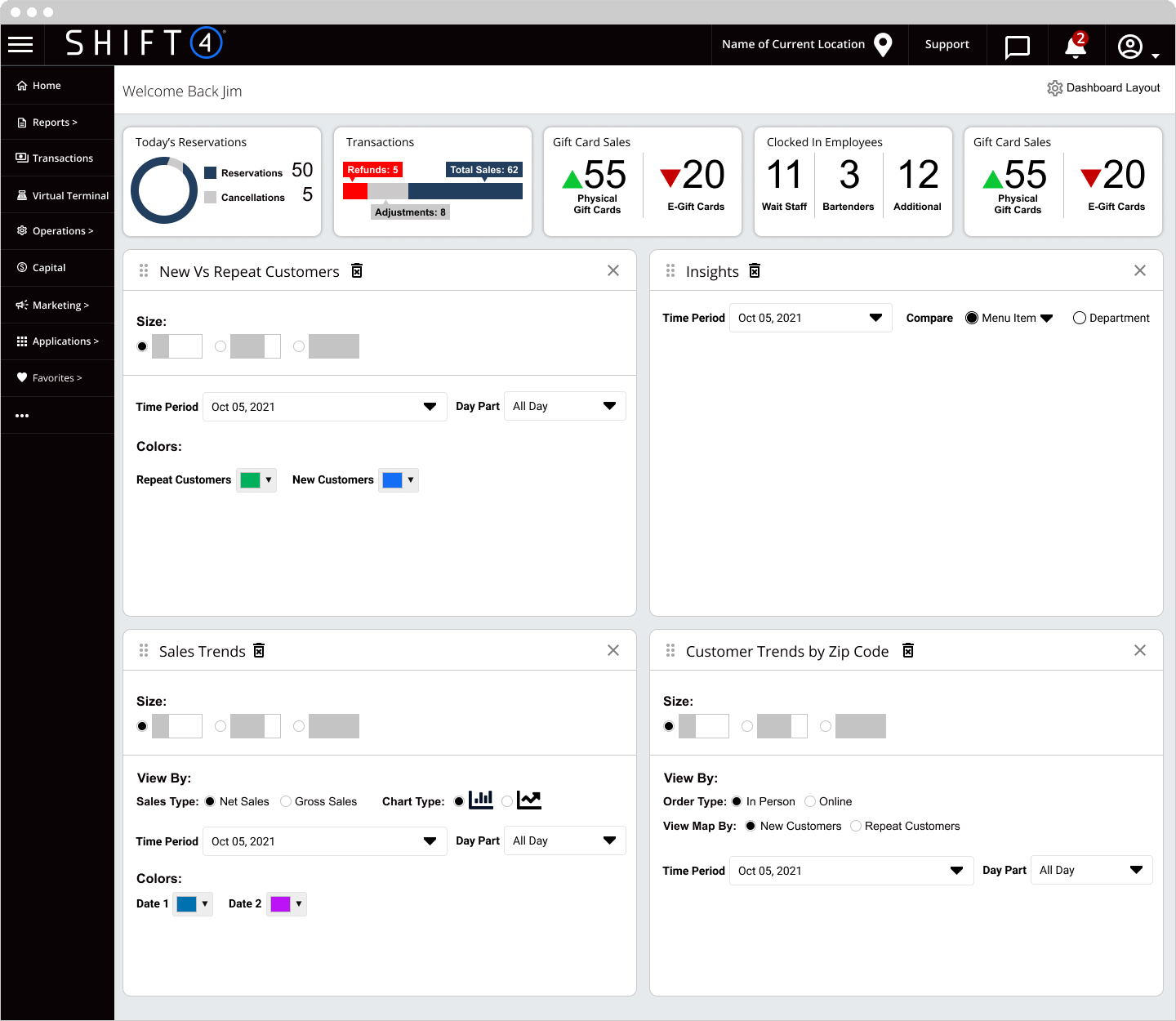
Design: Dashboard Widgets
The existing dashboard was difficult to interpret and offered limited actionable insight. During user interviews, we specifically explored how operators wanted to understand their data and what questions they needed analytics to answer.
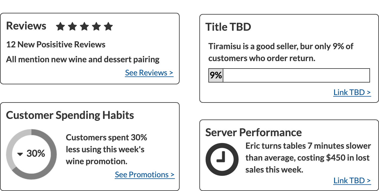
Based on this feedback, we designed a series of dashboard widget concepts to surface trends more clearly and support better decision-making. Each widget was paired with documentation explaining its purpose, behavior, and the insights it enabled.
Key concepts included:
Widgets were designed to be flexible, allowing users to switch between full and compact views, rearrange layout, and filter data by date range, time of day, shift, order type, and other operational dimensions.
The Sales Trends concept was designed specifically to support inventory planning, staffing decisions, and performance comparisons over time.
New Vs Repeat Customers

A clear breakdown of new versus returning customers, available in full and compact views. Users can filter by date range, time of day, shift, order type, and other operational criteria — giving operators the context to act on the data, not just read it.
Sales Trends

Designed to support inventory planning, staffing decisions, and performance comparisons over time.
Wireframes & Layout
To bring the navigation and widget concepts together I produced a series of wireframes defining layout, hierarchy, and interaction patterns across the platform. These addressed the three core problems identified in research navigation depth, dashboard clarity, and multi-location reporting and established a clear structural foundation for future visual design.
Client
Services
- Customer Research
- Information Architecture
- Wireframes
- User Experience Design
- User Interface Design
- Visual Design
Tools
- Balsamiq
- Figma
Discovery Elements
Architecture
Widgets Reports
Home Page/Dashboard
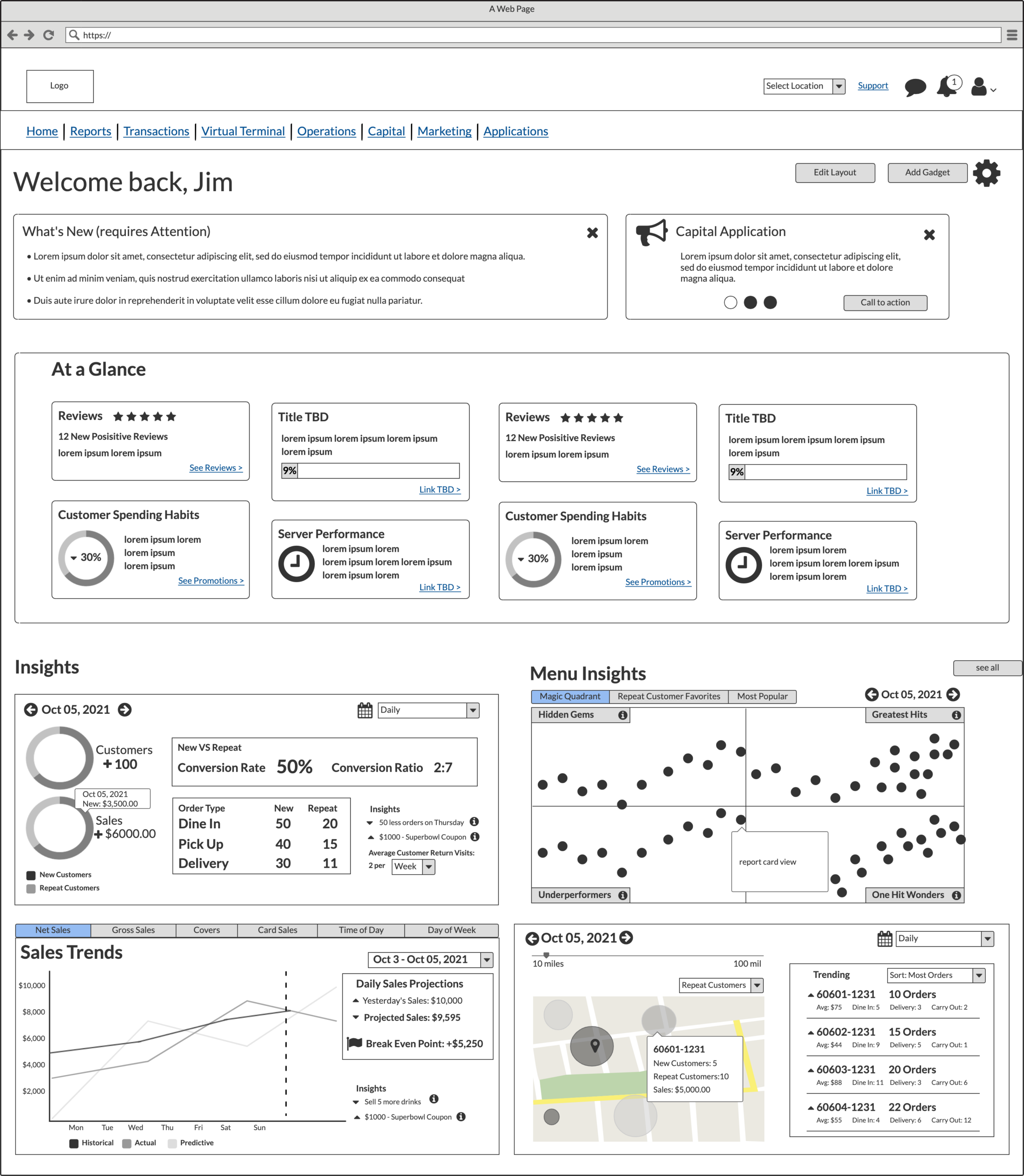
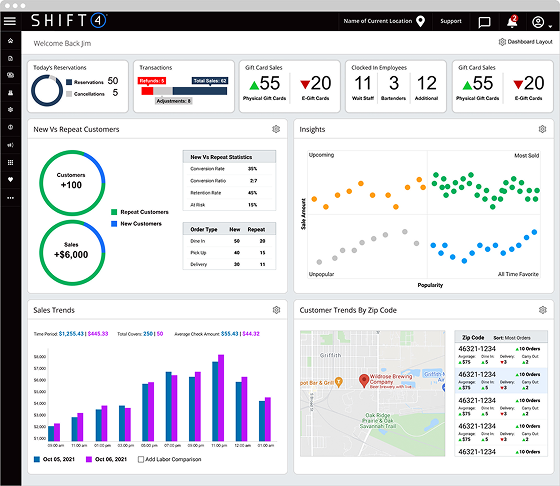
This proposal explored an updated dashboard designed to present information in a clear, scannable format. The layout prioritized widgets that highlighted new features, surfaced items requiring attention, and allowed users to customize the dashboard based on their needs. The Insights section focused on analytics concepts developed as part of this work.
Menu Structure
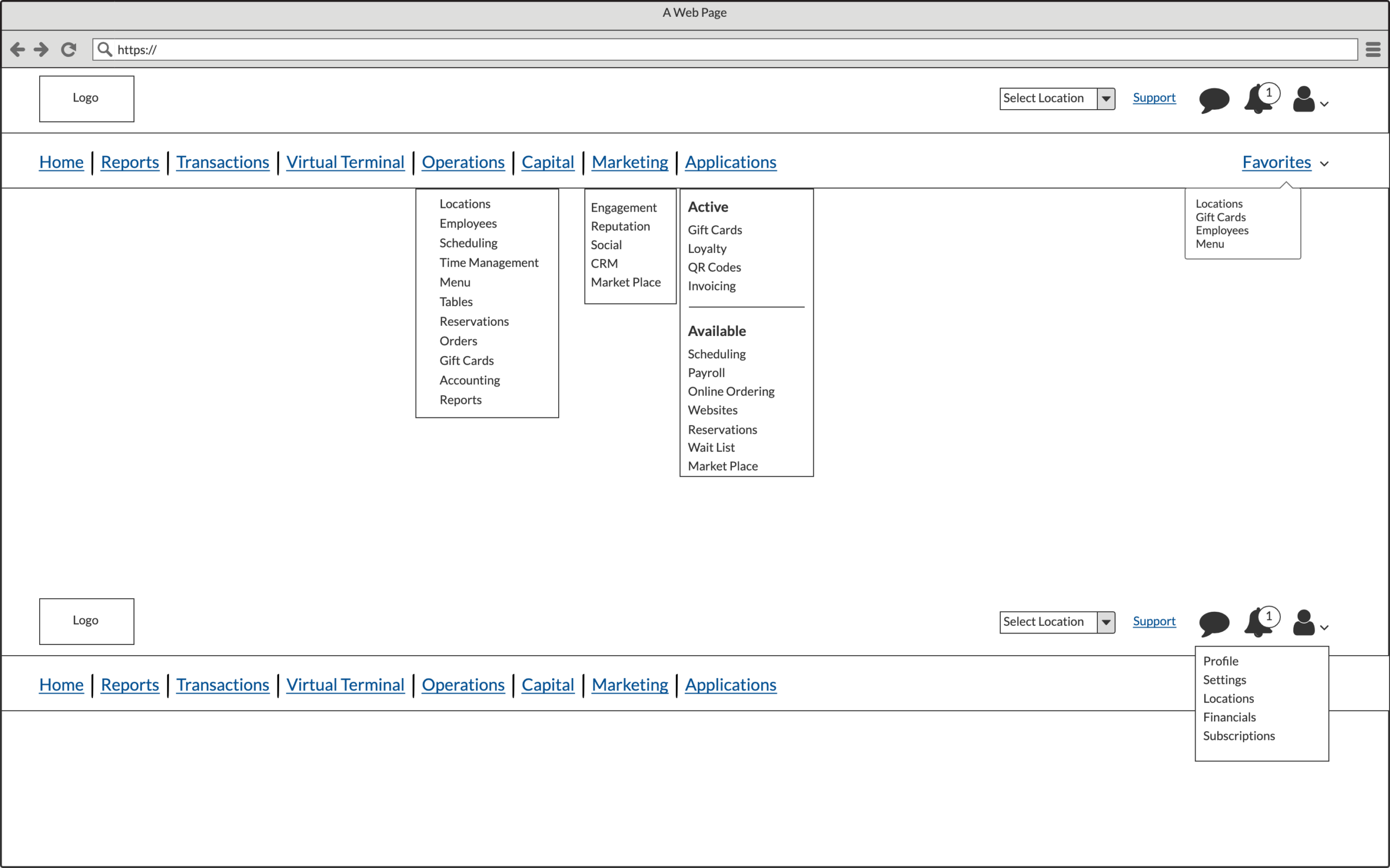
In the original LBM, the navigation was vertical, but users frequently complained about excessive scrolling caused by deeply nested menus that expanded downward rather than flying out. This forced users to scroll the entire page to access menu items.
I initially explored a horizontal navigation as a potential solution, but through continued evaluation it became clear that a vertical structure was still the most scalable approach. The final concept retained vertical navigation while introducing fly-out submenus, eliminating unnecessary scrolling and improving access to deeper sections.
Dashboard Widget: At a Glance
We introduced an “At a Glance” section as a customizable dashboard view, allowing users to surface up to eight key metrics immediately upon login. This provided a quick snapshot of performance and helped users assess how the business was performing at a moment in time.
Dashboard Widget: New VS Repeat
A clear view of customer behavior helps business owners identify opportunities to improve operations and increase retention.
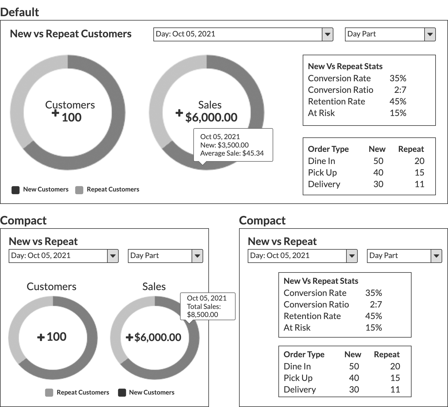
Dashboard Widget: Product Insights
Product Insights allows users to compare menu items and understand their relative popularity. Data can be filtered by date, department, or individual item, with rollover interactions providing additional details for each data point.
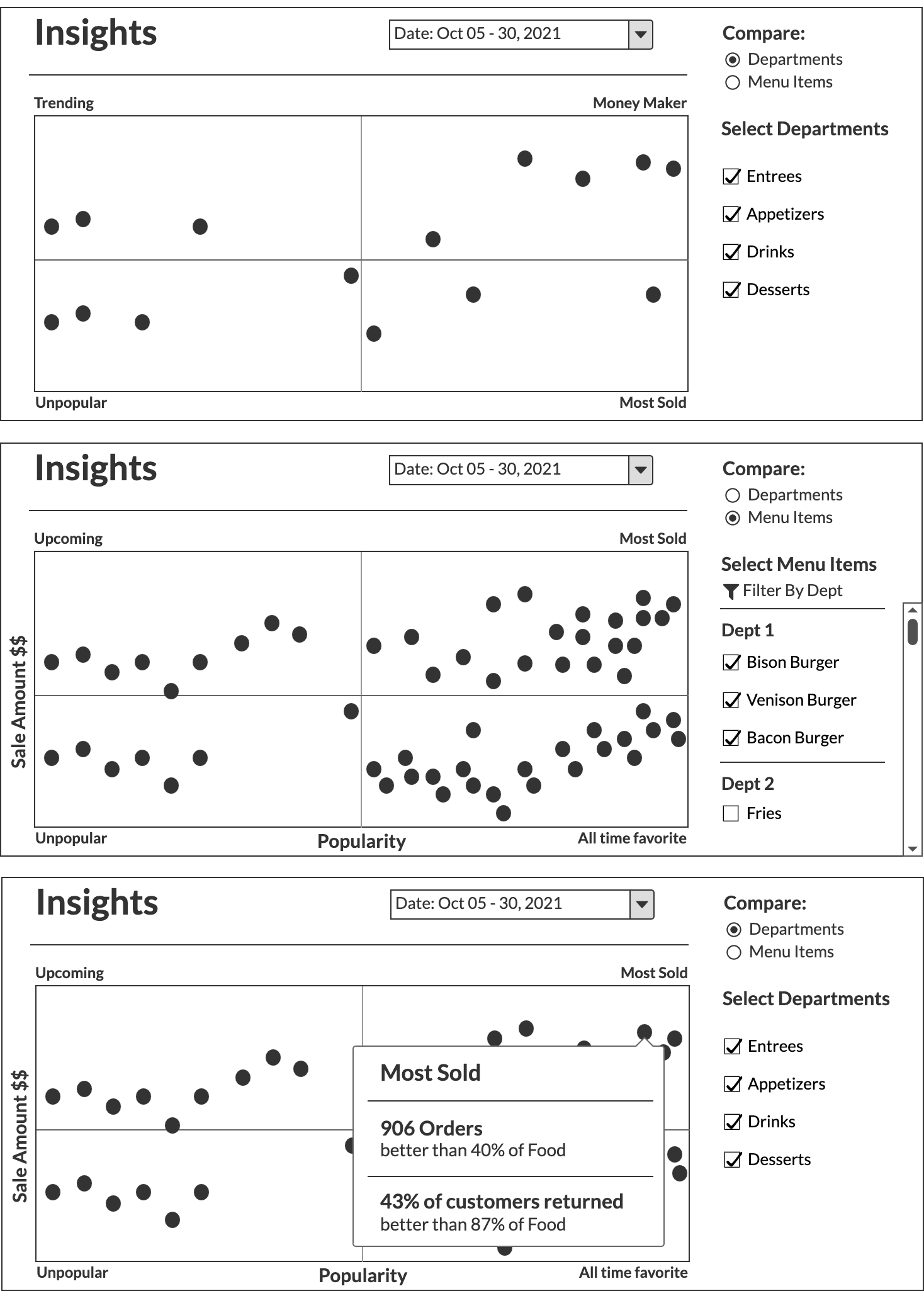
Dashboard Widget: Customer Trends by Zip Code
Customer origin data enables more targeted marketing, improved personalization, and earlier identification of emerging trends.
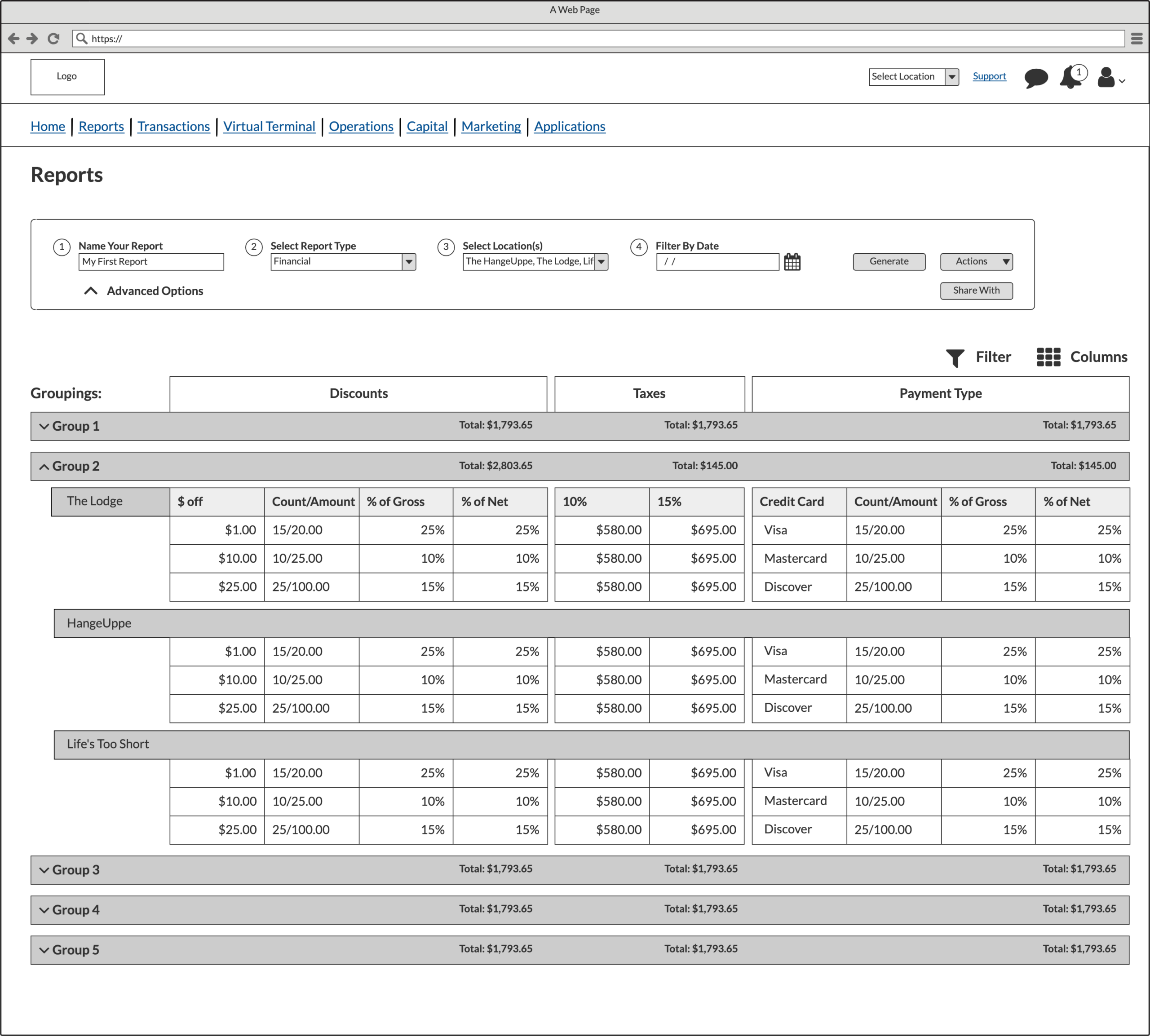
Reports Dashboard
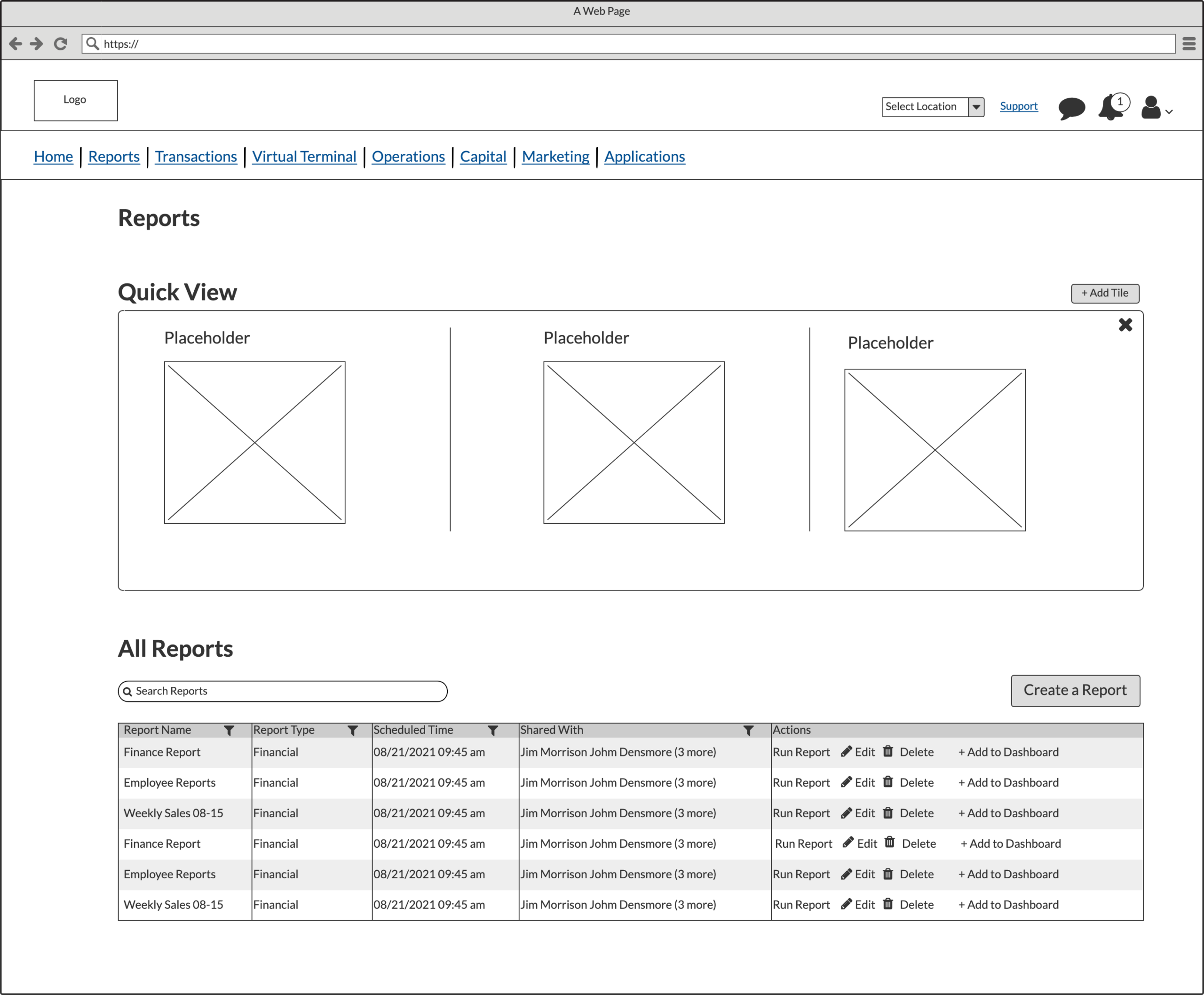
Users reported that existing reports were hard to customize, difficult to set up, and couldn’t handle multi-location data the top complaint across customer interviews. I designed a reports dashboard with an optional Quick View section, letting users pin and access their most-used reports instantly.
Reports: Create New
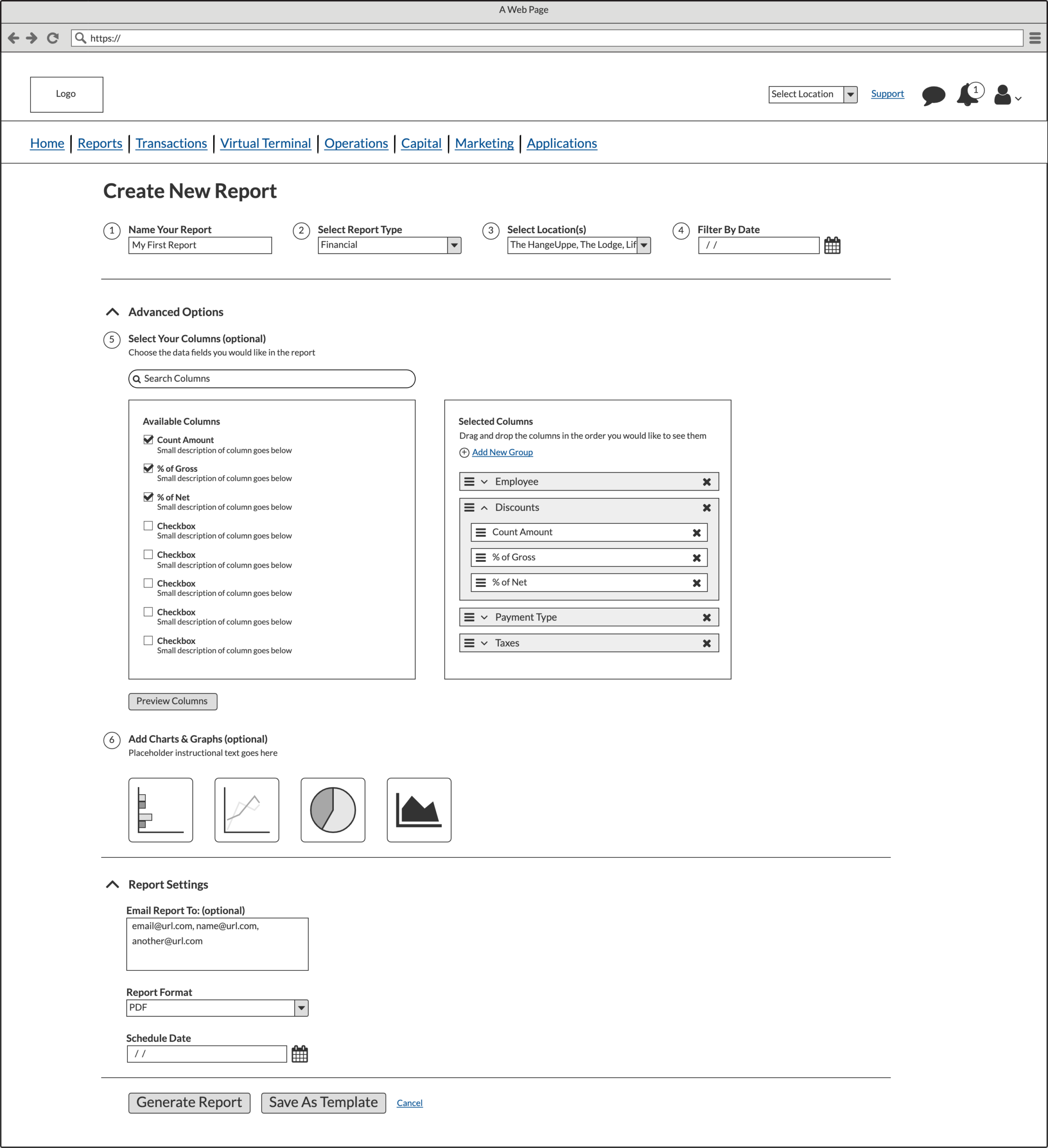
I streamlined report creation to four clicks for a standard report, while giving power users advanced options for column customization, grouping, chart types, and reusable templates full control without overwhelming casual users.
Outcomes
The research phase surfaced a clear and consistent set of pain points: navigation was difficult to use, reporting was hard to customize, and the existing dashboard failed to surface the information operators actually needed. These findings gave the product and analytics teams a shared, evidence-based foundation to work from rather than relying on assumptions.
The information architecture work resolved the core navigation problems identified in both the audit and the interviews. The shift from a flat vertical menu to a split navigation system with fly-out submenus eliminated the excessive scrolling that had frustrated users in the original platform.
The dashboard widget concepts directly addressed the gap between the data LBM collected and the insights operators could actually act on. New vs. repeat customer tracking, product performance comparisons, and sales trend analysis gave users a way to assess performance at a glance and drill into specifics when needed. The reporting redesign cut the report creation process down to four clicks for standard reports while giving power users full control over columns, groupings, charts, and templates.
Business Impact
The research and design work established a strategic foundation for LBM Next that was grounded in real operator feedback from the start. By leading interviews before any design decisions were made, the team avoided building toward assumptions and instead addressed the issues customers had been experiencing. The product owner described the reporting wireframe as directly solving the pain points that had frustrated customers most.
Visual Designs Desktop
I produced early visual design concepts for the dashboard, navigation, and mobile experience before the project was paused following a change in product ownership. These designs reflect the intended direction and key UX decisions — they were not taken to final design.
Dashboard Widgets
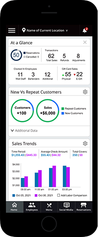
An icon-based menu keeps the layout clean. Expanding the hamburger reveals button labels clarity without sacrificing space.
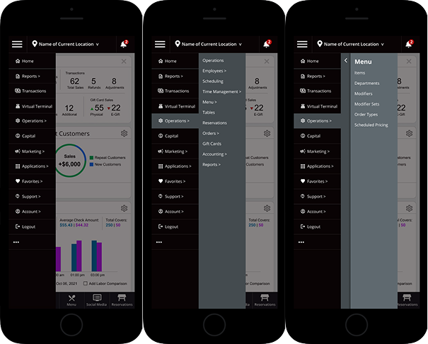
Menu Expansion
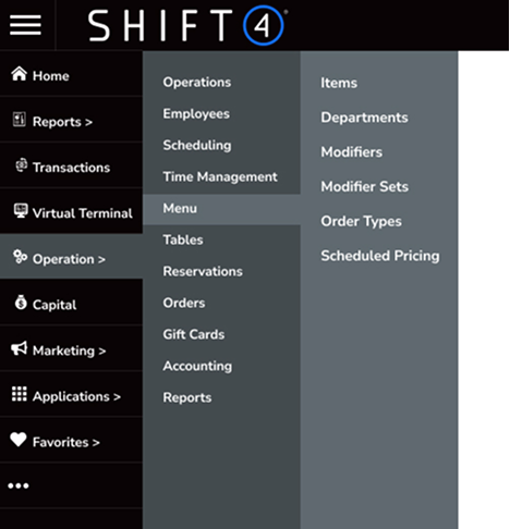
The original vertical menu expanded downward, forcing users to scroll through all options. The redesigned navigation expands horizontally via fly-out submenus, keeping all options accessible without page scrolling.
Edit Dashboard
Clicking the gear icon on any widget flips it to reveal an edit panel — users can adjust size, colors, and parameters directly from the dashboard without leaving their workflow.
Dashboard Small Widget View
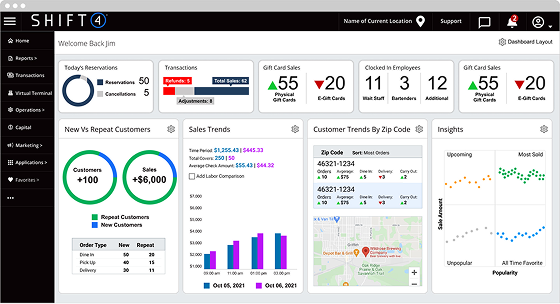
Widgets in compressed state with icon-based navigation. Expanding the hamburger reveals button labels — supporting both compact and fully labeled navigation experiences.
Visual Designs: Mobile
As we explored whether to build a native app or make LBM responsive, I designed mobile screens to validate how the navigation system and dashboard widgets would translate to smaller devices. These concepts informed the responsive direction before the project was paused.