Project Overview
Early into my tenure at Jirav my boss, the head of Product, asked me to do an assessment of their application. He wanted me to go through the app and document where I could find “easy to fix updates.” The goal was to find things the developers could easily update but would help the overall experience of the product. These were considered quick wins.
I quickly became more familiar with the application and determined there were several areas I could help improve things. I took screenshots of trouble areas and listed out my concerns next to the images to help create context. Before I shared them with the product team I sat down with the developers so I could get a better understanding as to why things were set up the ways they were. I have found out in the past sometimes there are technical constraints that force the developers to build things in a less than user friendly way.
Project Elements
Presentation – The original “presentation” was an excel file with all the issues and screenshots put together. However, for portfolio purposes it didn’t quite translate so I copied and pasted all the details into a Power Point which I then saved as a pdf. These are all my original observations.
All the designs are viewable as well. I show a few screens below, but I made several changes to the screens, some were subtle and others were rather big.
Outcome
In the results I will show the issue with a screen shot and then show the solution below. These are only some of the updates I created.
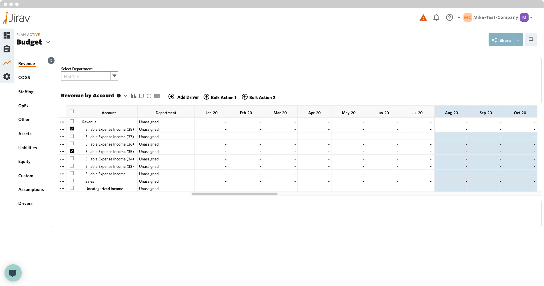
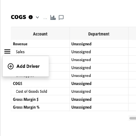
Plans: Table Actions
Most table actions were under the three dot overflow menu. Also, the “+ Add Driver” function was hidden.
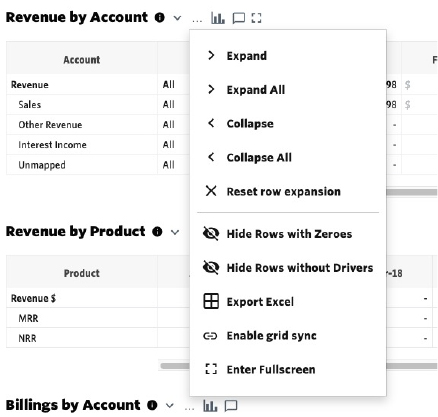
I added a background to the overflow menu and brought the “+ Add Driver” button out to be more visible.
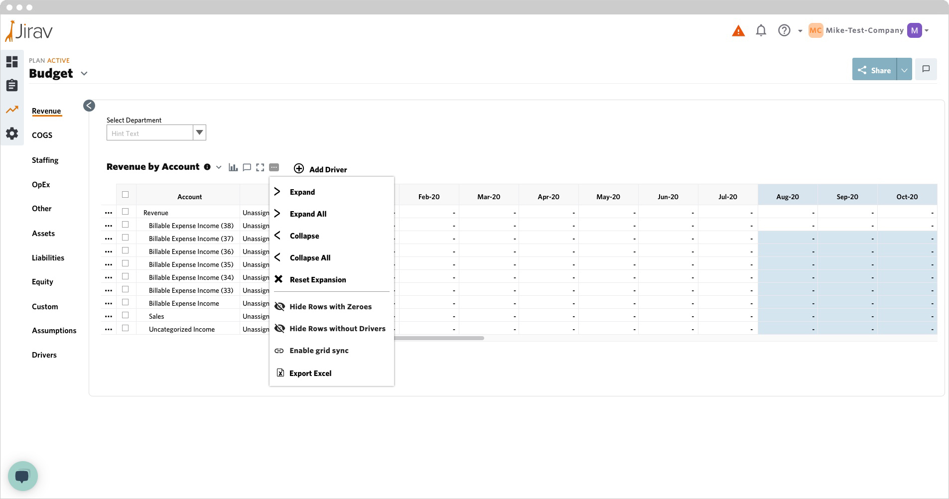
I also added Bulk Actions (these depended on what the table status was) when rows were selected.
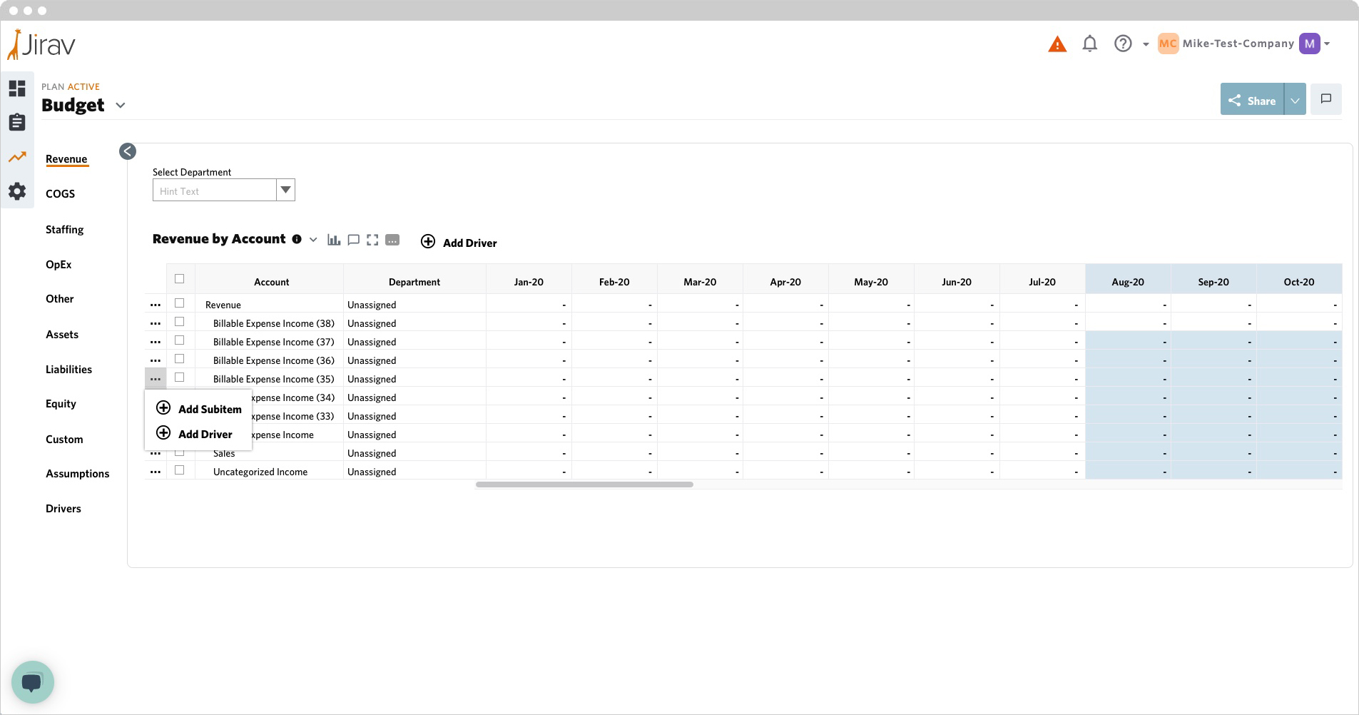
Plans: Table In-Row Actions
On the original design the user had to rollover the “sweet spot” outside the table row to perform an in-row actions. Also, the original design used a hamburger menu icon to for additional actions.
My solution was to add an additional column with an overflow menu that is always clearly visible the user can click on to see the actions.
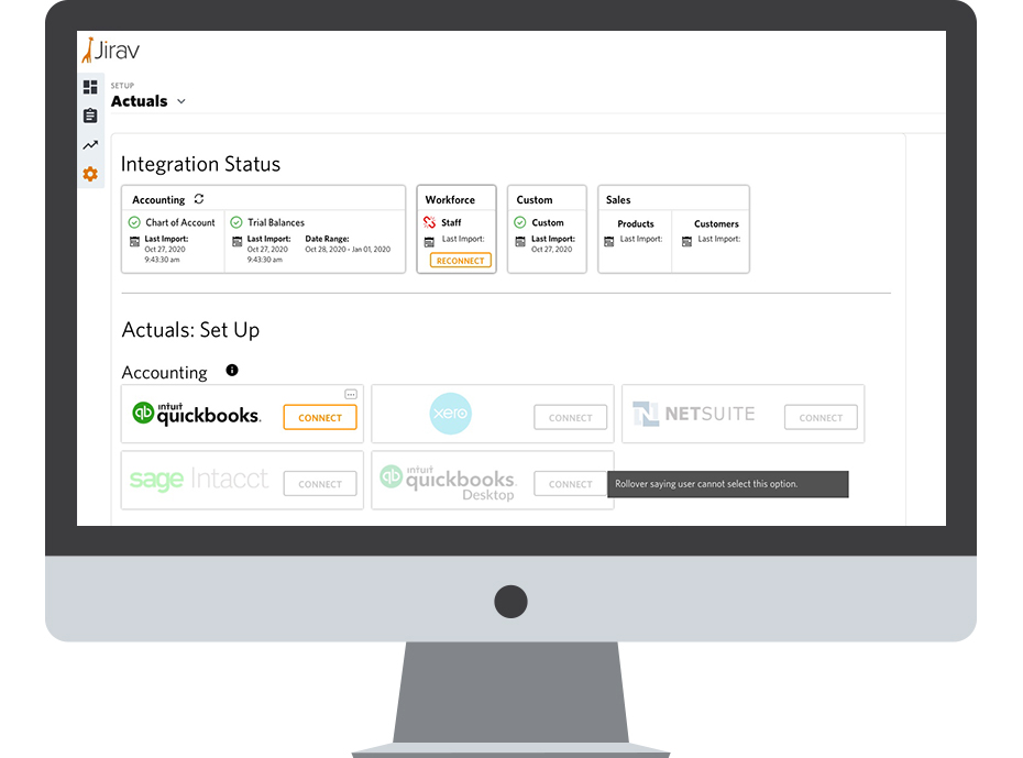
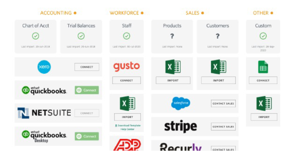
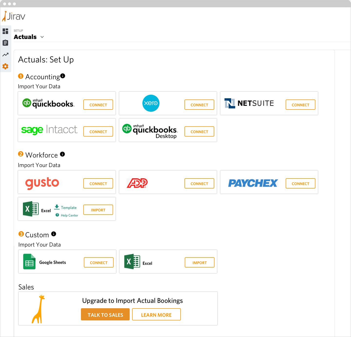
Set Up Landing Page
The Set Up Landing Page is where a user goes in the Jirav app to connect their financial data to the application. The user first connects their accounting information, then their workforce and lastly their “custom data,” which consists of any additional financial information that can be used for predictions.
The original version was very confusing and difficult to navigate. It wasn’t clear what the sections or calls to action were. I redesigned the screens into an easier to understand layout where the user could clearly see the different sections and what order things went.
This is the view a user will see the first time they come into the set up area. I made sure to show the user the steps in order that needed to be completed. I also added an upsell at the bottom so the can upgrade for additional features.
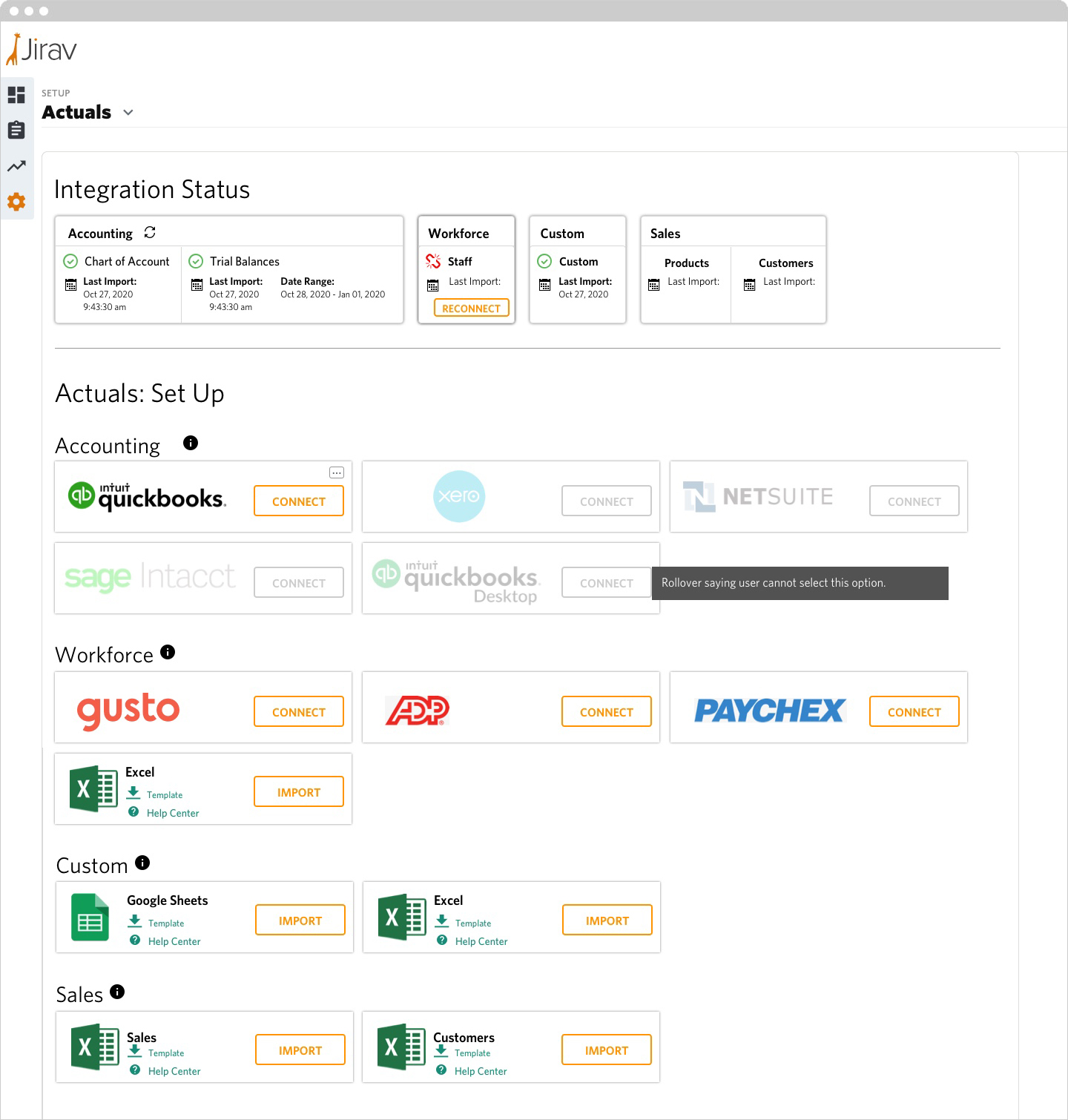
Once a user connects their accounting data, specifically Quickbooks, they can no longer import other accounting data until they disconnect Quickbooks by clicking the overflow menu in the upper right corner of the card. This view also shows what happens if the user loses connection to one of the outside sources. In this case they need to reconnect their workforce. Custom and sales data can constantly be updated.
The top of the screen shows the current status of the connected data. It shows the last import and date range where applicable.
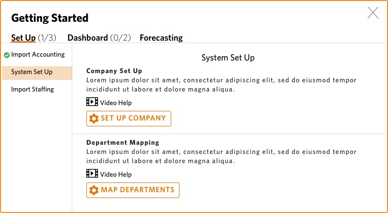
Set Up Dashboard
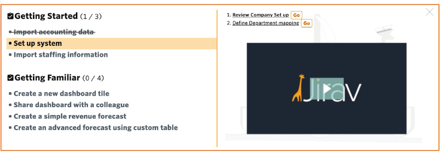
When a user first comes to Jirav they have a list of tasks they need to complete. The original idea for the set up was to create a checklist that showed the user their remaining steps, some links to take the user where they needed to go and the occasional help video.
My concerns were:
• The vertical orange line makes it feel like two different sections and it’s not obvious the left side controls the right.
• The two “GO” buttons in the right column look like a call to action when in reality they launch a video.
• All the videos have the same opening frame, it is not obvious the videos change
• In the Getting Started areas the actions on the right get lost in the “chaos.”
• Crossing out completed tasks look like a CSS error not a checklist
I fixed the issues by introducing a brand new navigation. I put tabs across the top and sub navigation down the left side. The tabs at the top show the user how many steps they have to complete per section. I turned this into a wizard that allows the user to complete many steps right here instead of having to navigate to different sections of the application.
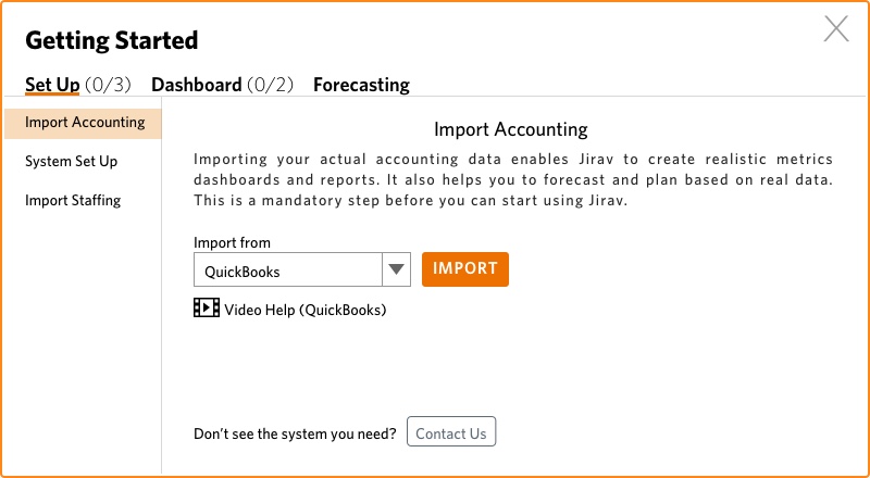
As the user completes a task the number in the tab changes to reflect the completed task. There is also a checkmark next to the task to remind the user what has been completed.