Project Overview
LBM Next was a concept that was meant to replace the current Lighthouse Business Manager. LBM is a restaurant management tool that handles every aspect of the hospitality business. It covers marketing, gift cards, reservations, scheduling, sales, reports and even short term business loans. However, as powerful of a tool as it is LBM had several issues, mostly it was not easy to use and did not give the customer useful analytics even though it collected an immense amount of data.
I was teamed up with a very talented data analyst and we were tasked with improving LBM. This was probably the most research intensive project I have ever worked on.
Our goal was to create a new dashboard that could help a user easily compare their “numbers” from the past to how they are doing today. Help track which servers have the best upsells. Which items are the most popular at what times of the day. Better understand their customers and where they come from. Aside from the dashboard, we wanted to make the reports easier to use. Lastly, it was important to make sure LBM was a responsive design.
Due to an internal shake-up and an acquisition this project was paused indefinitely as the person in upper management pushing these updates was re-assigned. We had just started visual design exploration at that time. Even though this project was never fully realized there was too much work and effort put into it to not share it on my portfolio.
Process
The project was broken down to 2 phases:
• Design
• Discovery
Discovery
The discovery for this project was rather intense and took several months. The very first thing I did was to get trained on how LBM works. After the training I did a comprehensive UX analysis. I tried to point out all the issues and inconsistencies I could find. I produced a 56 slide presentation that went through every section I had access to with my login credentials. I distilled the presentation down to a two page report for “easier consumption.
After submitting the report I then conducted a series of interviews with current customers and customer support. You can see a more detailed description of that process here.
After the the interviews I sat down with the head of product and analytics and we put together a series of goals for LBM. We wanted to make LBM a top of the line business management tool by correcting its current issues and improving its features.
Design
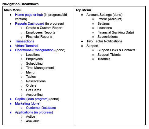
The first thing we tackled was the information architecture. We performed a few card sorting exercises and restructured the whole menu. Then we went through the app section by section and put together wireframes showing what the basic concept of each page would be.
Below is a simplified information architecture.
Click here to see the initial navigation presentation.
The existing dashboard was cumbersome and didn’t supply enough analytics. During the interviews my partner on the project, an analytics expert, we also asked the users several questions about how we could improve our analytics. Based on the feedback we wireframed a series of proposed dashboard widgets to present the data.
We created several screens showing different dashboard widget states like rollovers, compact vs default views, applying filters and different tabs views. We also updated a series of other pages and sections, with special focus on report creation.
The next step was to focus on the widgets we created:
Analytics Thoughts, an overview the widgets we designed and how to use them.
Widgets
• Customer Trends By Location
• Customer Retention vs Customer Acquisition
• Sales Trends
Outcome
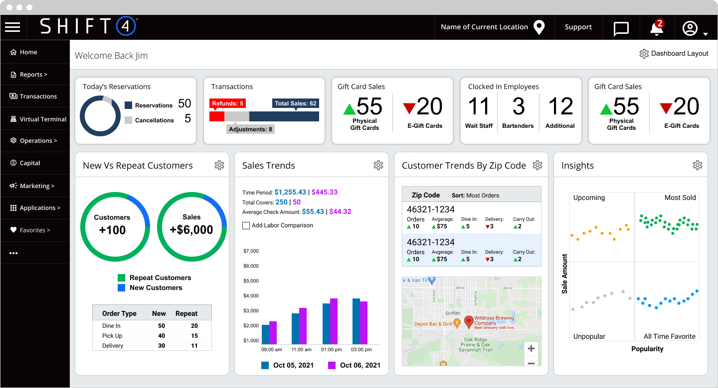
Dashboard Visual Design
In the wireframes I attempted to make the navigation horizontal, but I realized very quickly due to the dynamic nature of the application horizontal would not accommodate all the menu items. I decided to return it to the vertical design that previously existed.
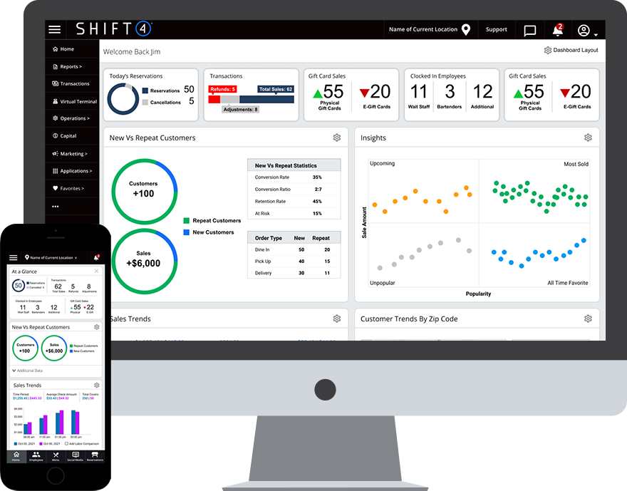
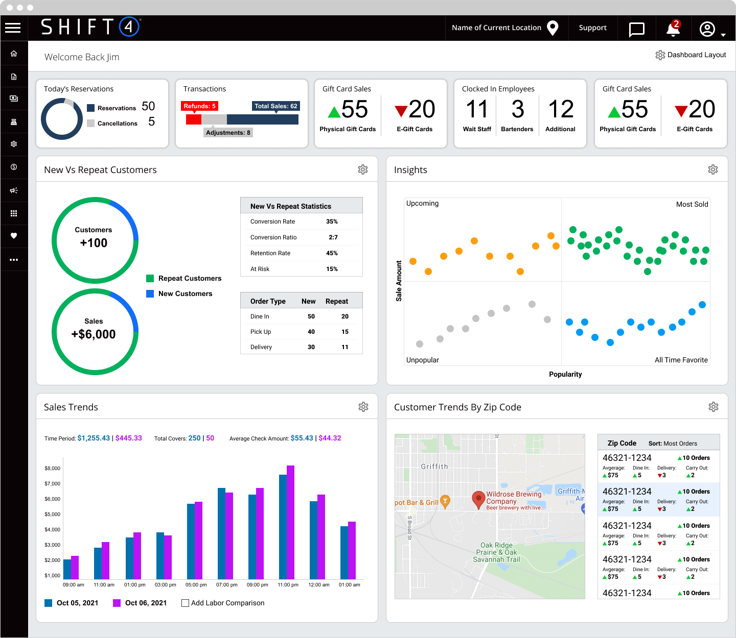
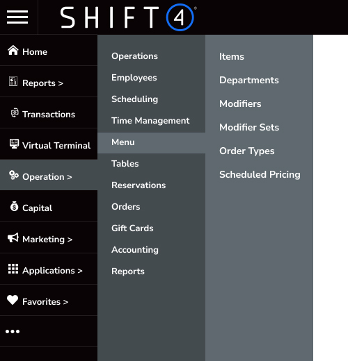
This view shows an icon based menu, if the user wants to see the button names they can click the hamburger menu and it will expand.
Edit Dashboard
If a user clicks the gear icon in any of the analytics widgets it will flip and expose the edit side. A user can set the size of the widget, colors and whatever available parameters they want to see.
Notice this screen shows a view of the menu with the button names expanded.
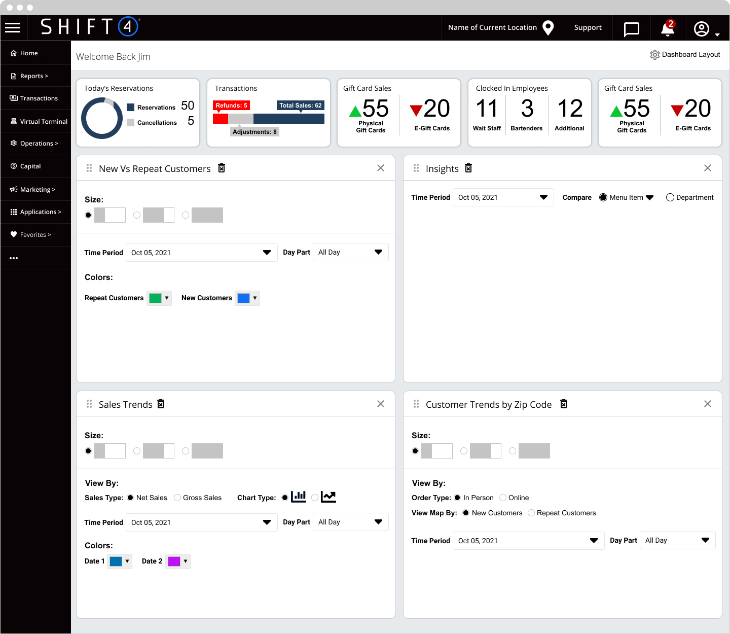
Dashboard Small Widget View
Menu Expansion
The original vertical menu had expand and collapse, but the menu expanded vertically forcing the user to scroll to see all their options and this created a great deal of annoyance. I thought it might make sense to expand horizontally.
Mobile Dashboard
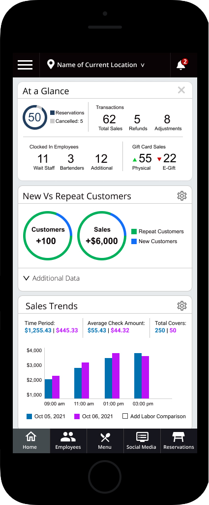
LBM Mobile Navigation
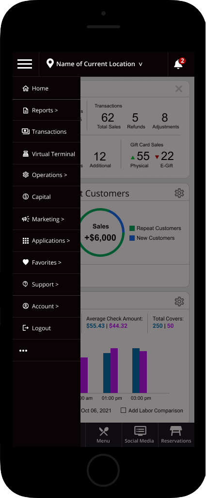
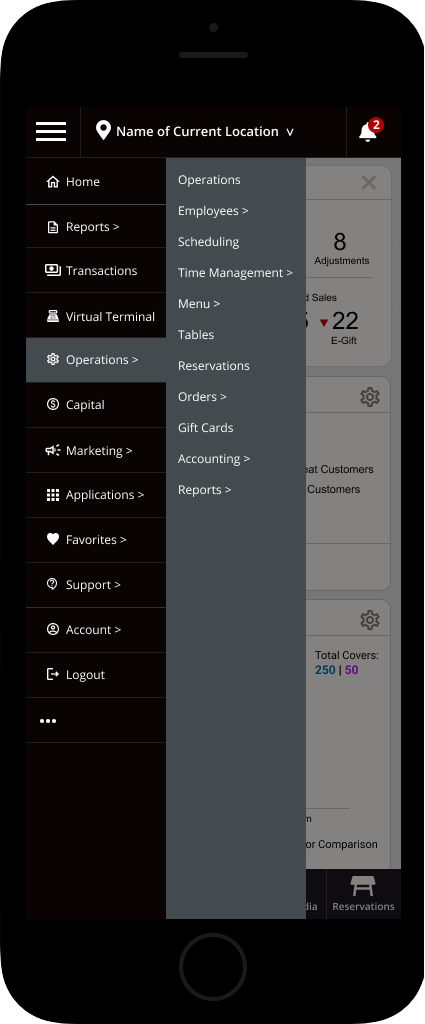
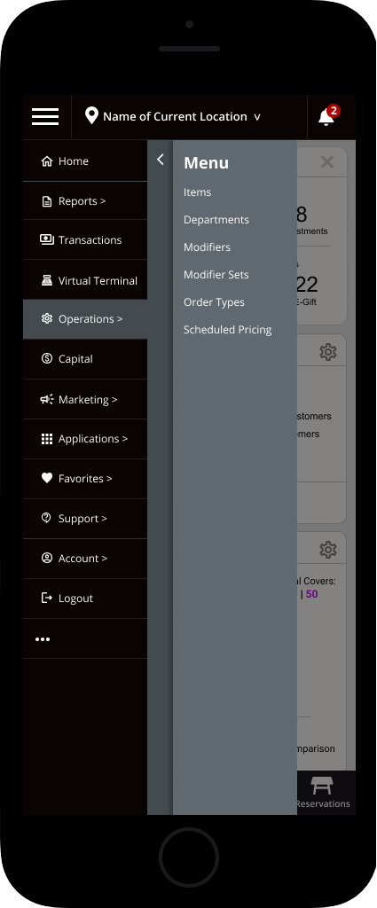
Dashboard Wireframes
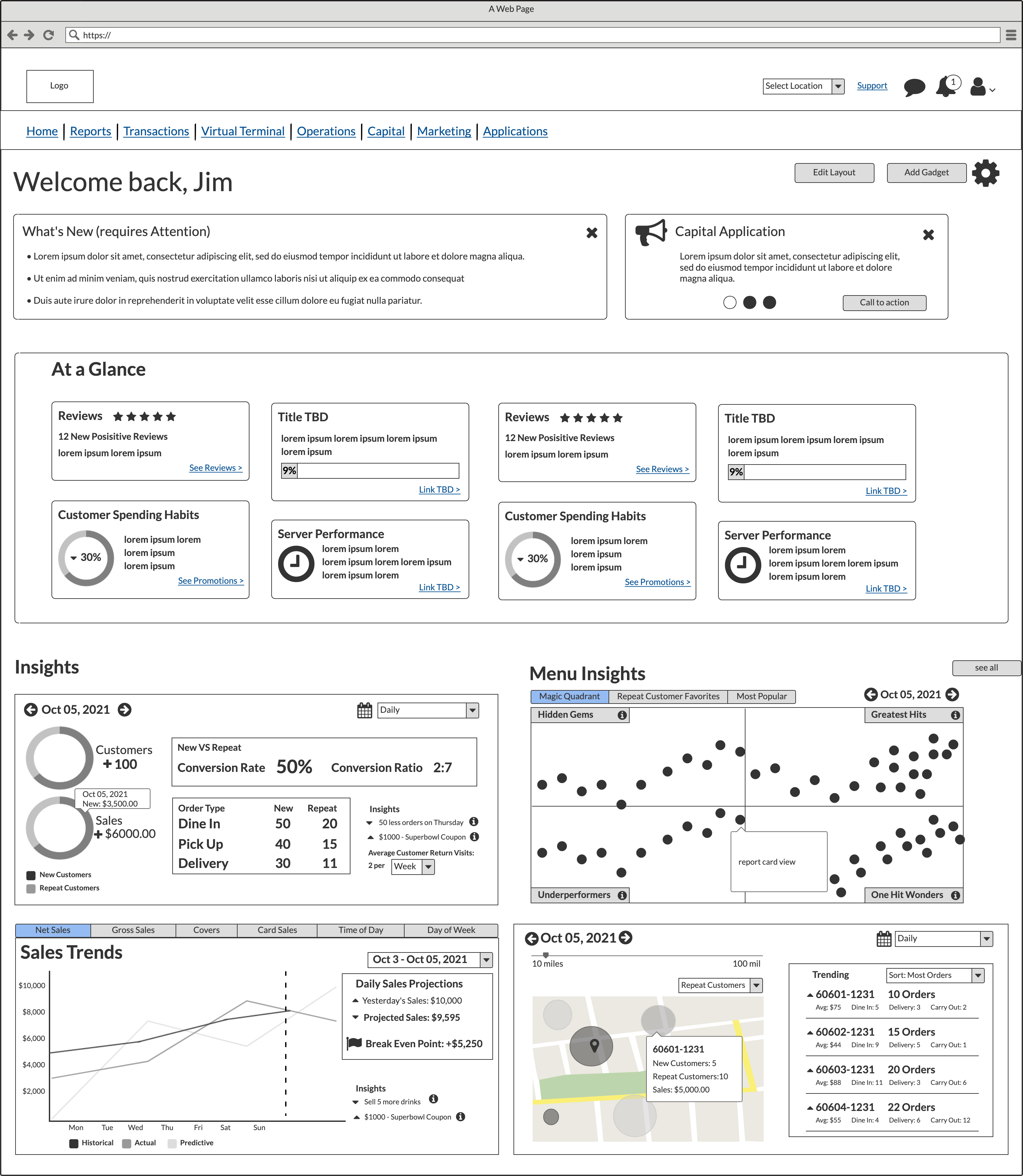
This was my proposal for an updated dashboard. My goal was to layout the information in an easy to read format. There are widgets advertising new features, calling out what requires attention and even the ability to customize the layout to the users needs. The Insights are the analytics we were working on.
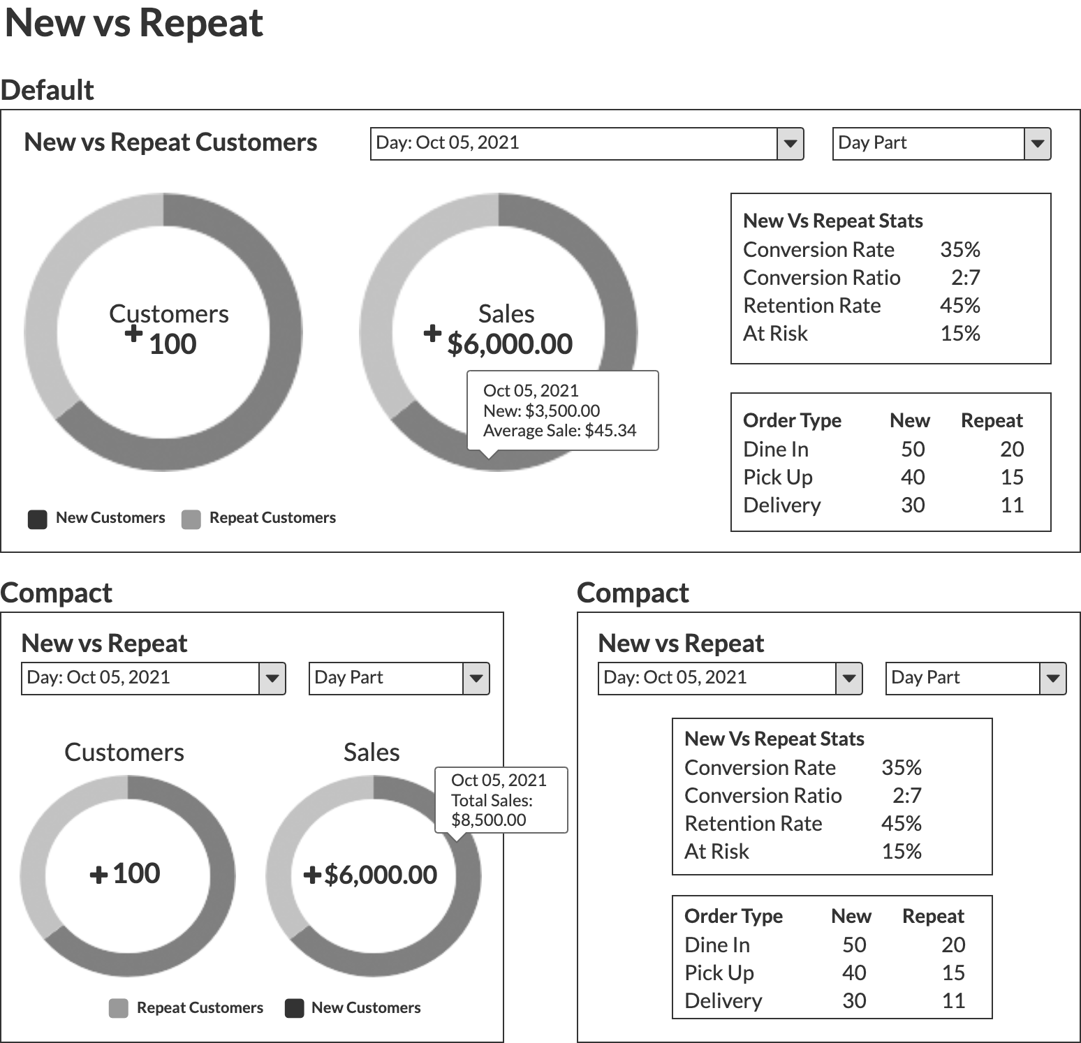
Dashboard: New Vs Repeat Customers
The user can see a break down as to how many new vs repeat customers come in. Each view was done in “full size” or compact. The user had the ability to edit the dashboard to set the size and location of each widget. They also have the ability to filter by date, time of day/shift, order type, etc.
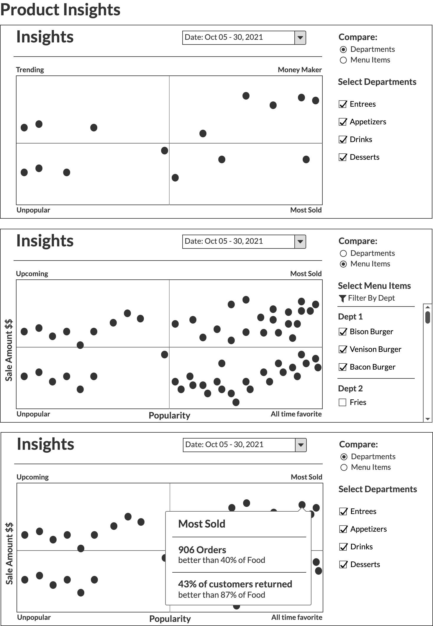
Dashboard: Product Insights
Users are given the ability to filter and compare product sales against each to determine the popularity of a specific item.
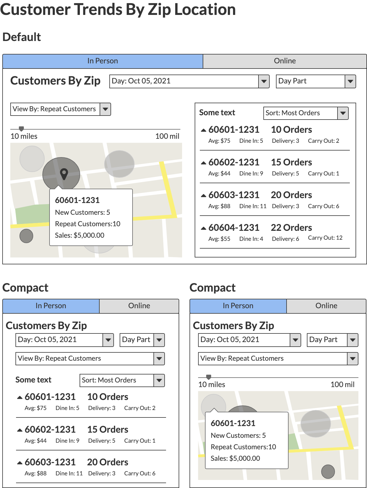
Dashboard: Customer Trends by Zip Code
Allows users to see where customers come from and helps them to target where their marketing efforts should go.
Dashboard: Sales Trends
For a comprehensive explanation of Sales Trends I recommend reading the detailed proposal.

Reports
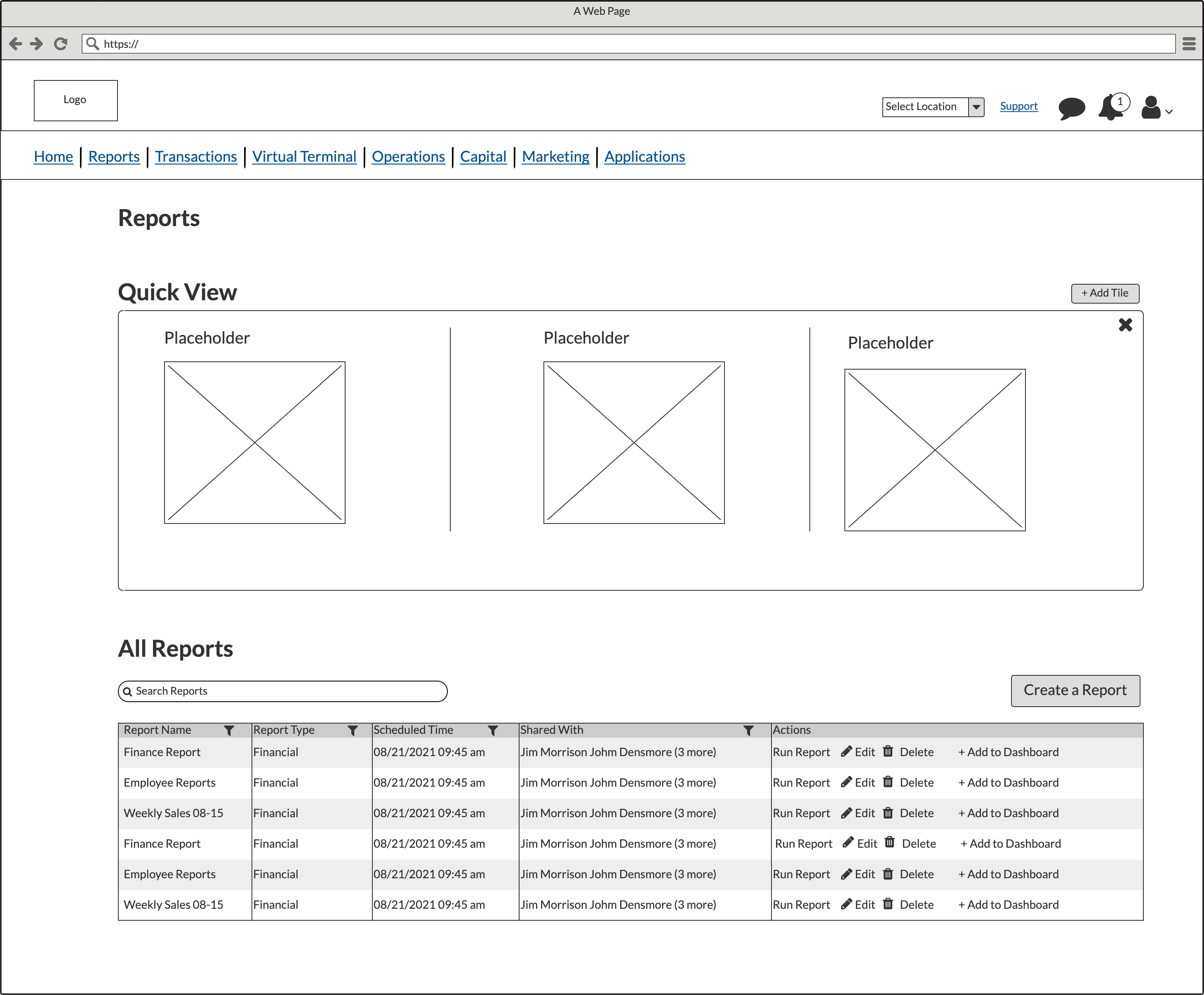
While working with one of the product owners she mentioned their reports sections was lacking customization, was difficult to set up and she heard from several customers they were angry they couldn’t do a multi-location report.
The first screen I created was a report dashboard. The dashboard has an optional “Quick View” area. This is a place where users can add their “favorite” reports.
Create a New Report
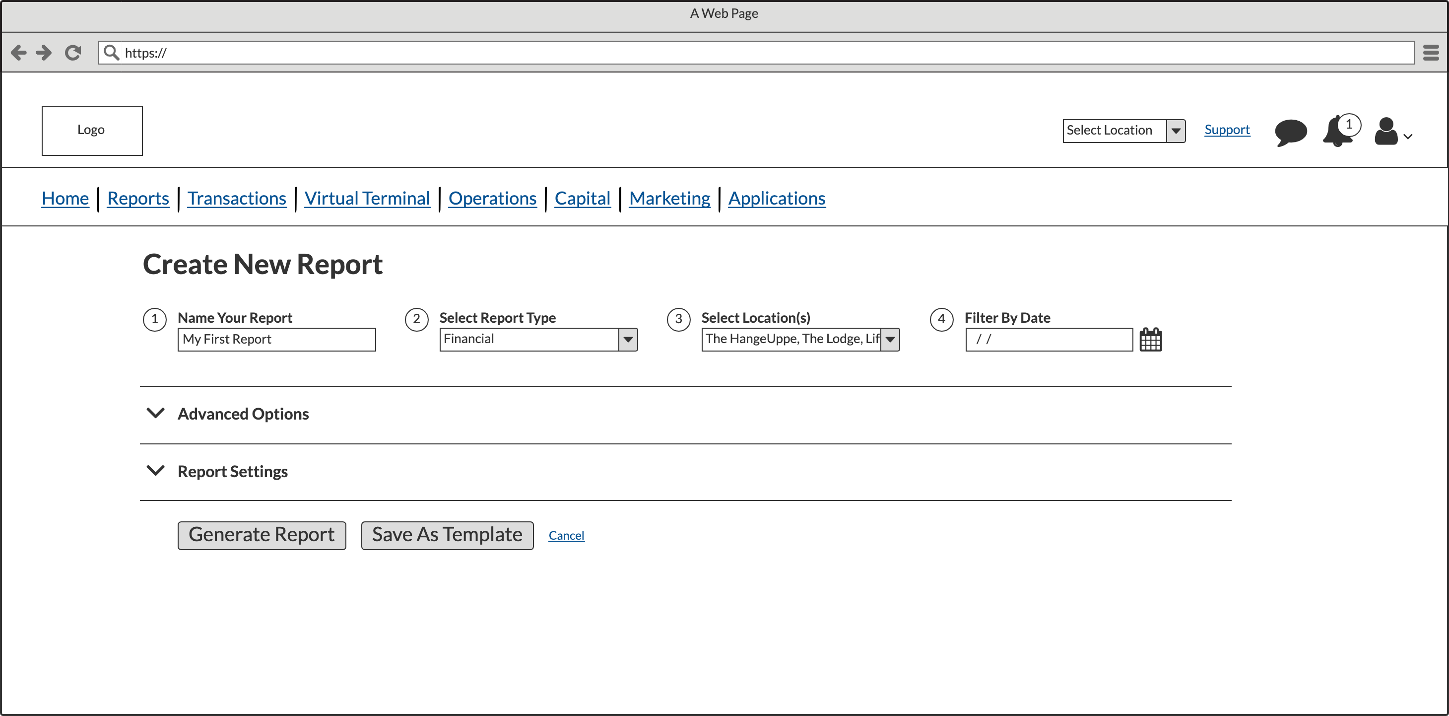
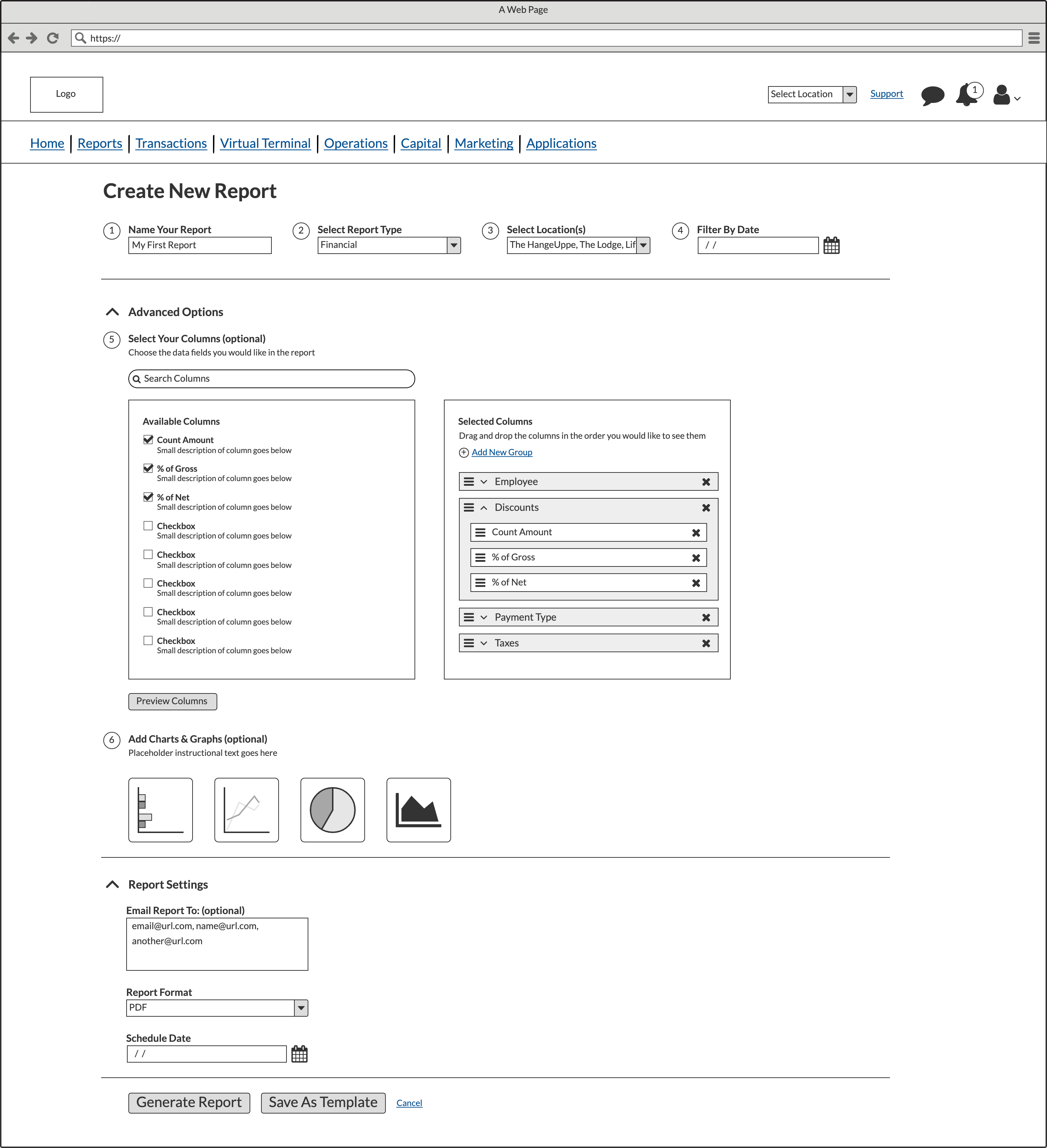
Create a New Report: Advanced Settings
The advanced settings allows the user to select their table columns, reorder them and nest them into groups. They can also add graphs and charts. Lastly, they can create templates.
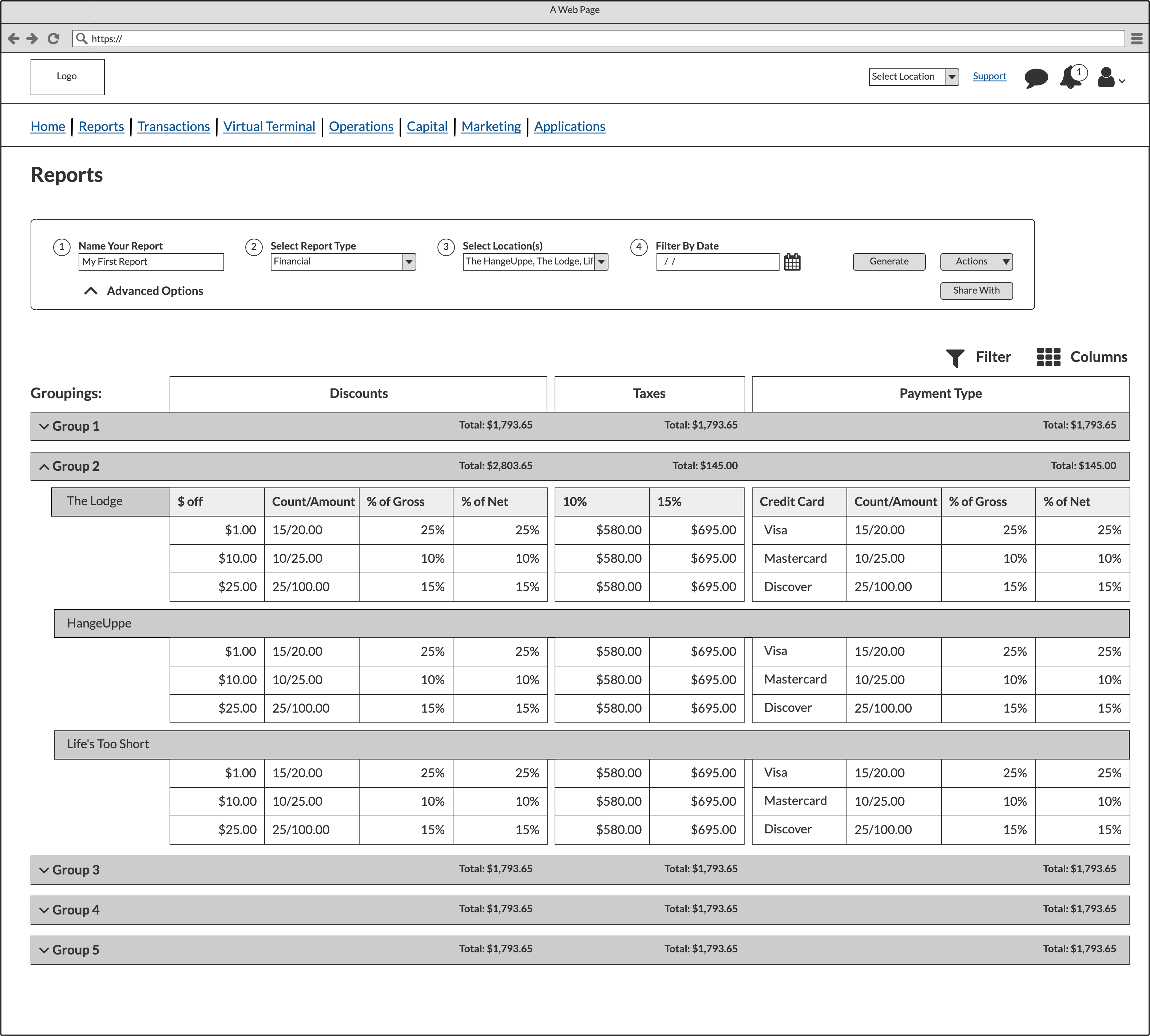
Report Created
I solved their problem of multi-location reports while simultaneously creating different sections inside nested tables. The product owner was thrilled when I turned in this wireframe.
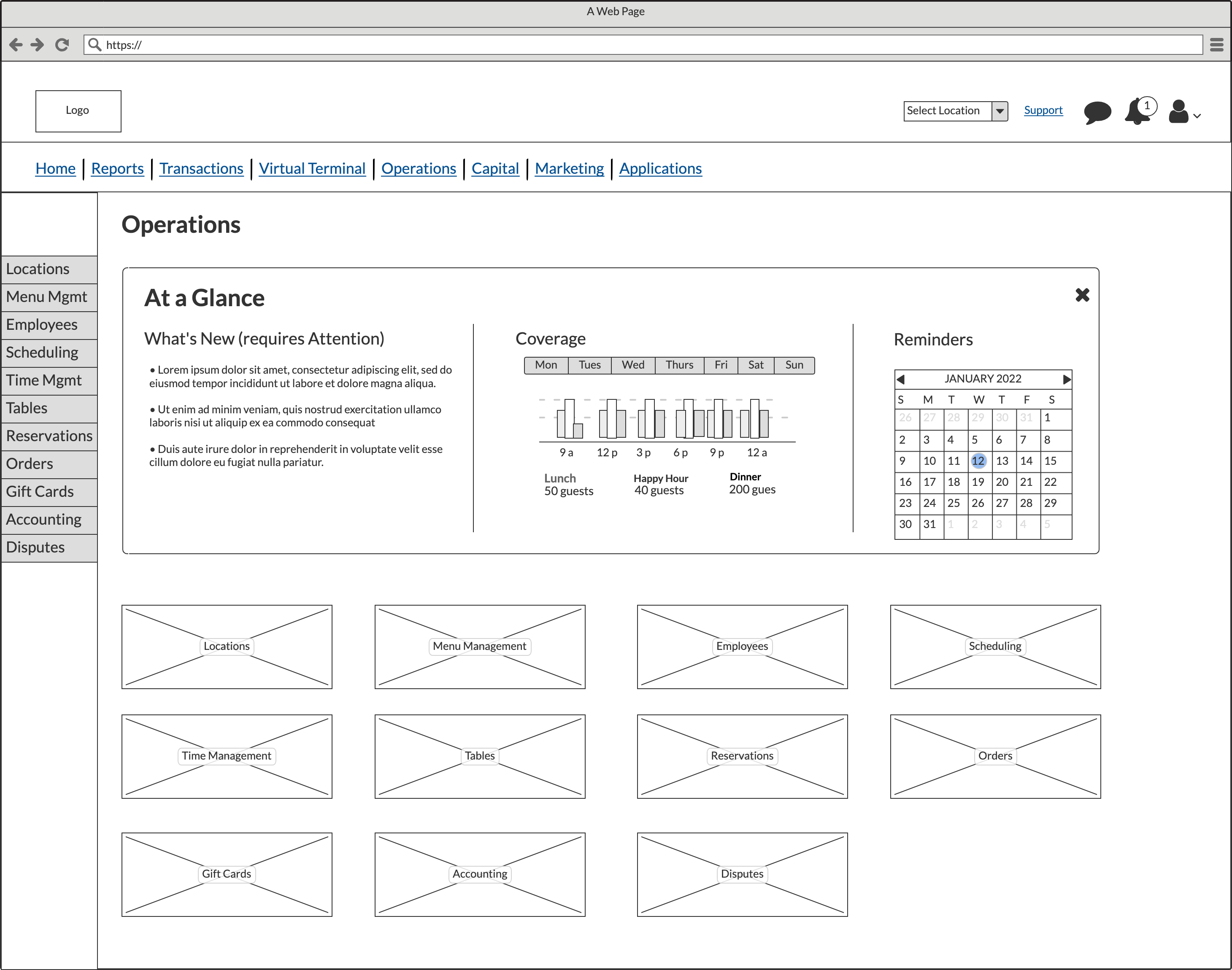
Operations
Operations (previously known as “Configurations”) functioned as a landing page and launching point to run a restaurant. A user could manage locations, handle scheduling, time management, reservations, etc all from one area.
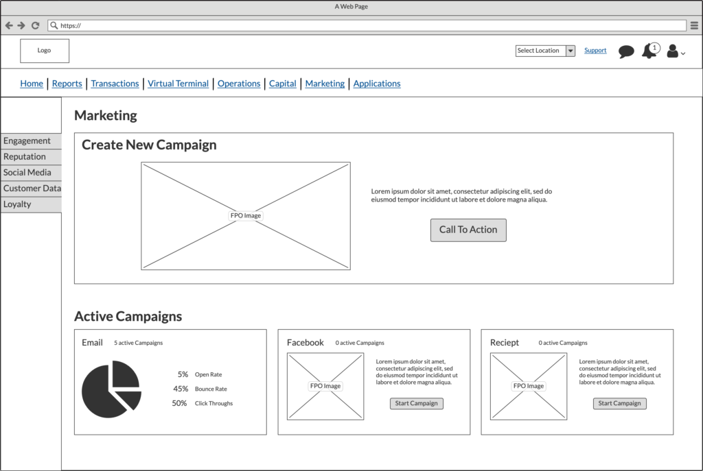
Marketing
Applications
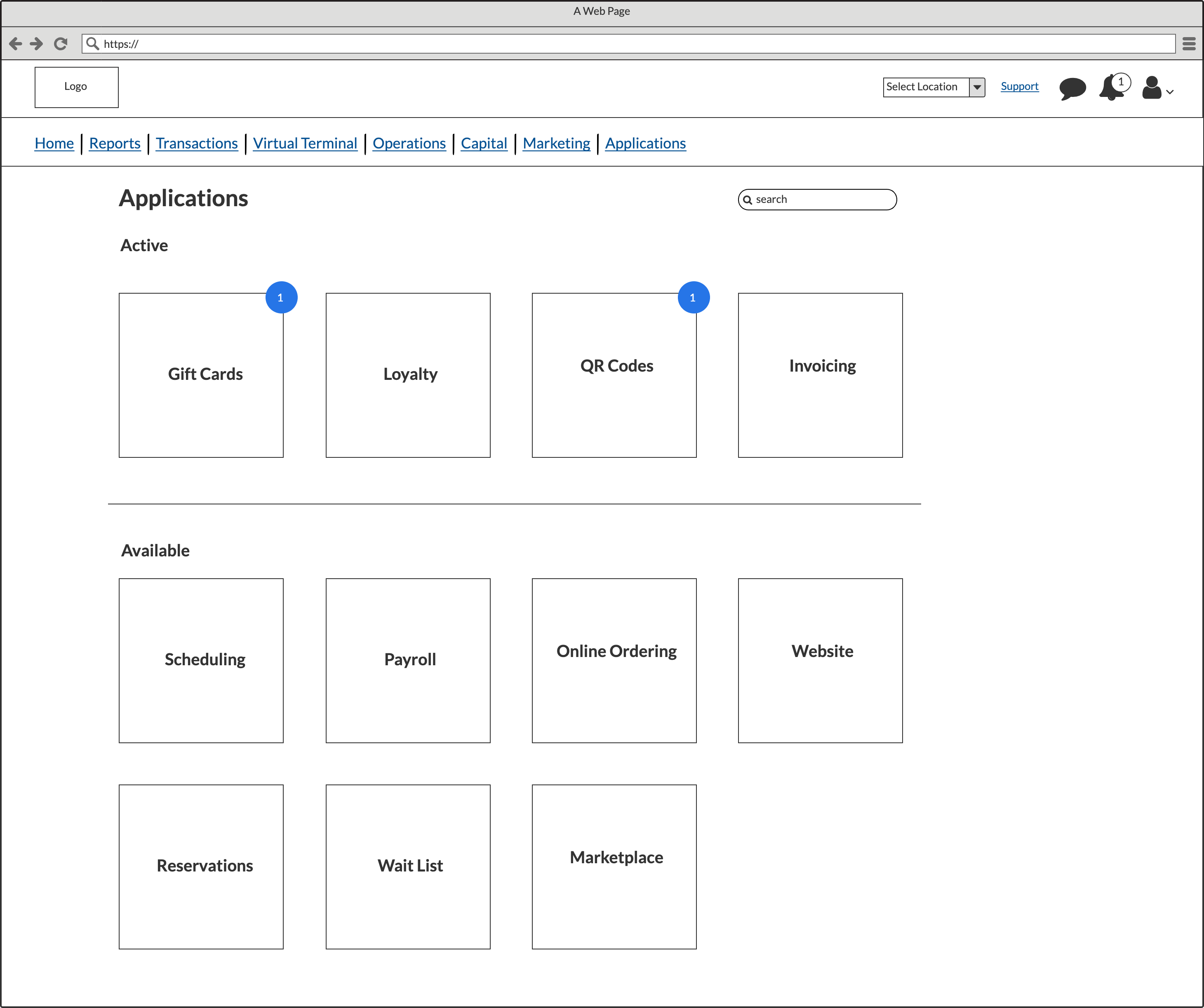
LBM allowed for third party applications or additional features that were called applications to be added to a user’s subscription. The blue circle with a 1 in them represents the app requiring the user’s attention.
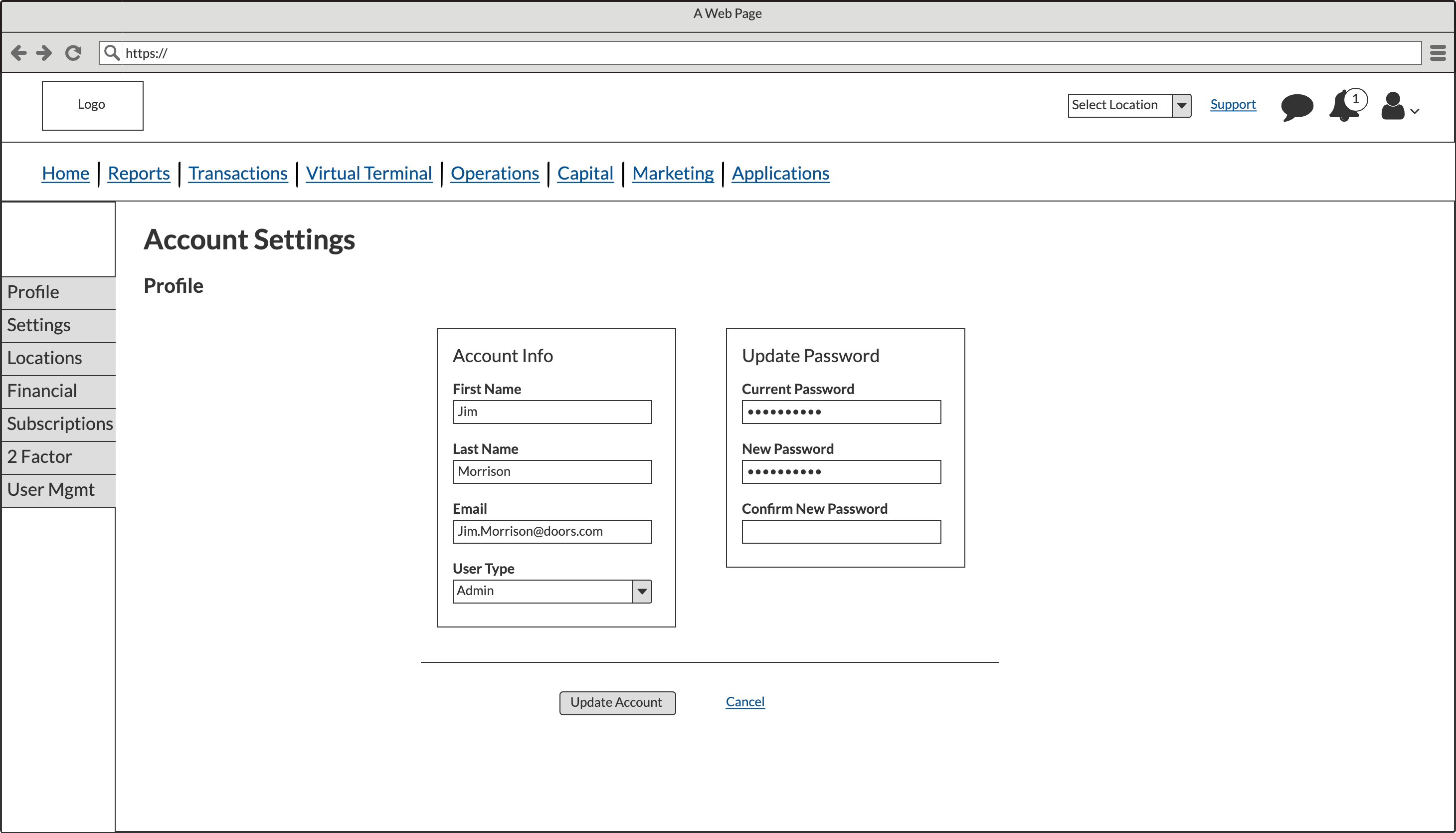
Account Settings
