At one time I was more of a marketing based designer, I have since moved onto enterprise level applications. However, my skills in conversion are still valuable so every now and then I pick up a project for a responsive landing page. Below are a few landing pages I have completed.
Future Finance
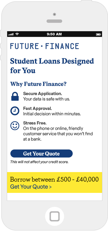
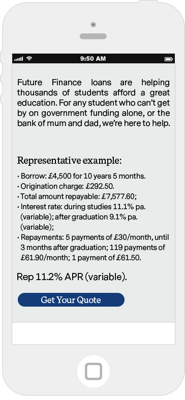
Future Finance is an Irish/UK based student loan company. They needed a responsive landing page to accommodate their younger users. According to their analytics, over 75% of their users were on mobile devices. Their target market were college students and their parents. I needed to create a page that appealed to multiple age groups.
Their previous landing page was suffering from a fairly high drop off rate. One of the issues with their previous page was a lack of a clear call to action as well as an overwhelming amount of content. My solution was to edit down the content to a series of bullet points. Unless it was a legal requirement or did not encourage the user to click “Get Your Quote” I cut it out.
The other issue was their photography. The people they used were constantly looking away from their body position which drew the user’s attention away from the messaging. In order to correct that I helped find new images on iStock. I specifically looked for people who were looking in the same direction as their body posture.
Browser View

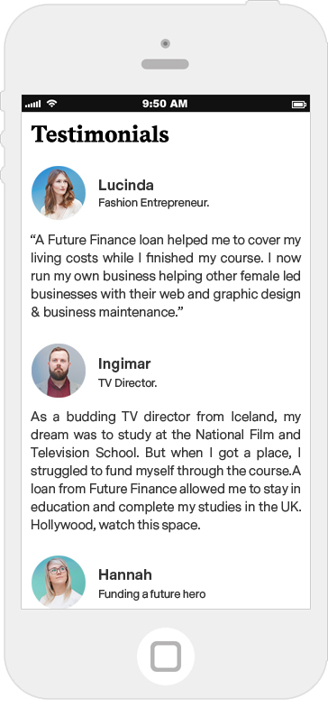
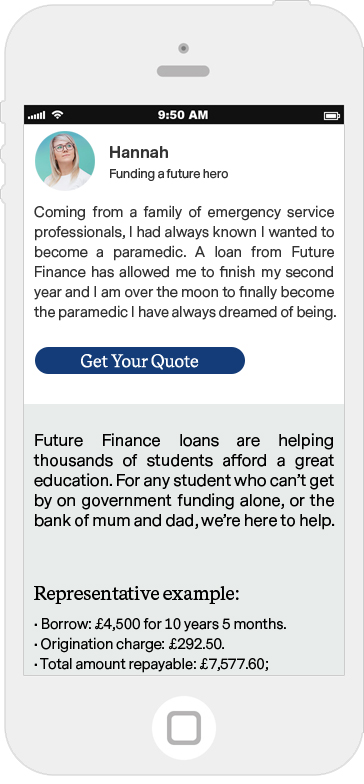
Mobile Views
Eligo Energy
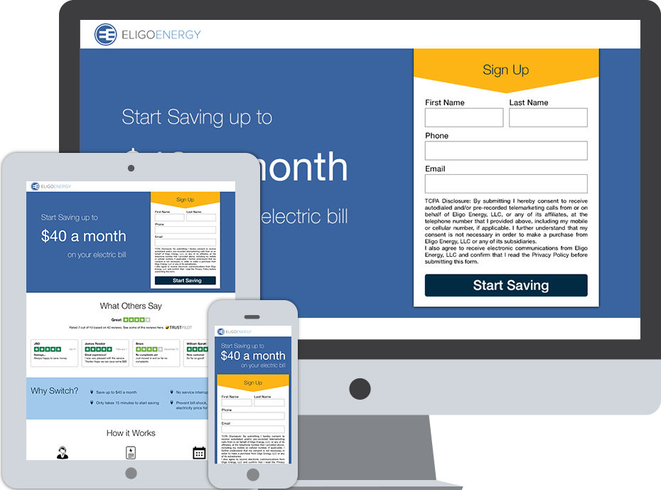
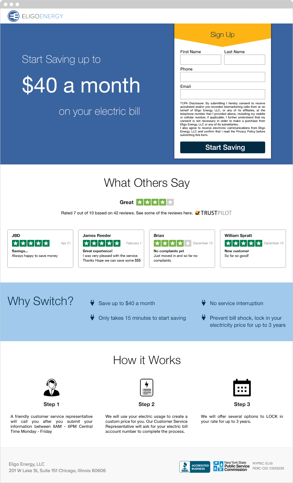
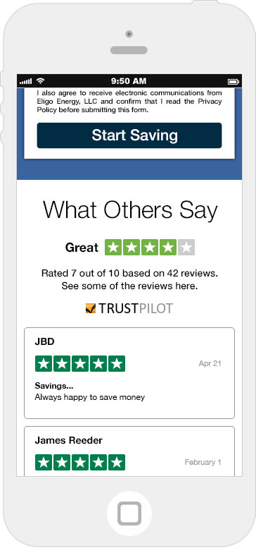
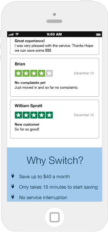
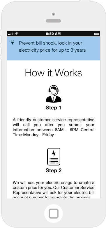
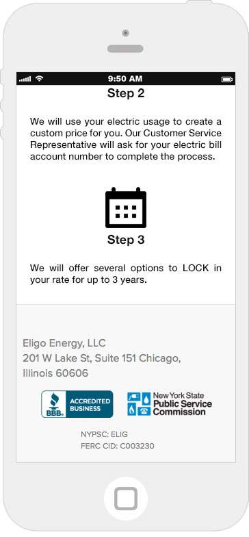
Eligo is an alternative electrical company. They were looking for a new landing page, it had to be responsive as roughly 80% of their traffic is estimated to be mobile. The end goal was to get a user to fill a simple form with their name, phone number and email address. After which a salesperson would call the user as a warm lead to discuss changing their electrical provider.
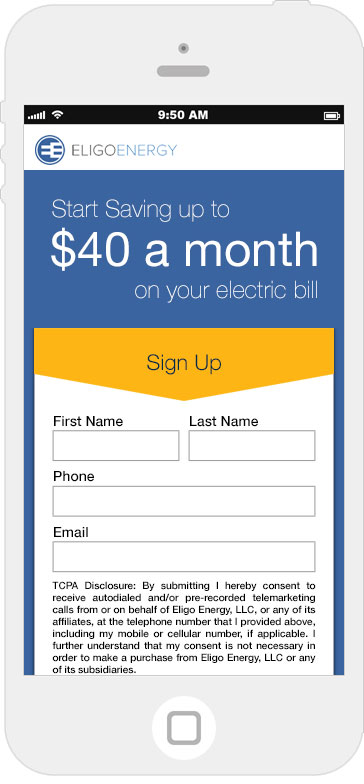
I worked with the marketing manager to find appropriate icons and colors. I made an obnoxious yellow arrow pointing directly to the sign up form. This worked to draw the user’s eye towards the form. It was especially effective on mobile as it contrasts nicely against the blue background of the hero phrase.
Browser View
Mobile Views
MS Real
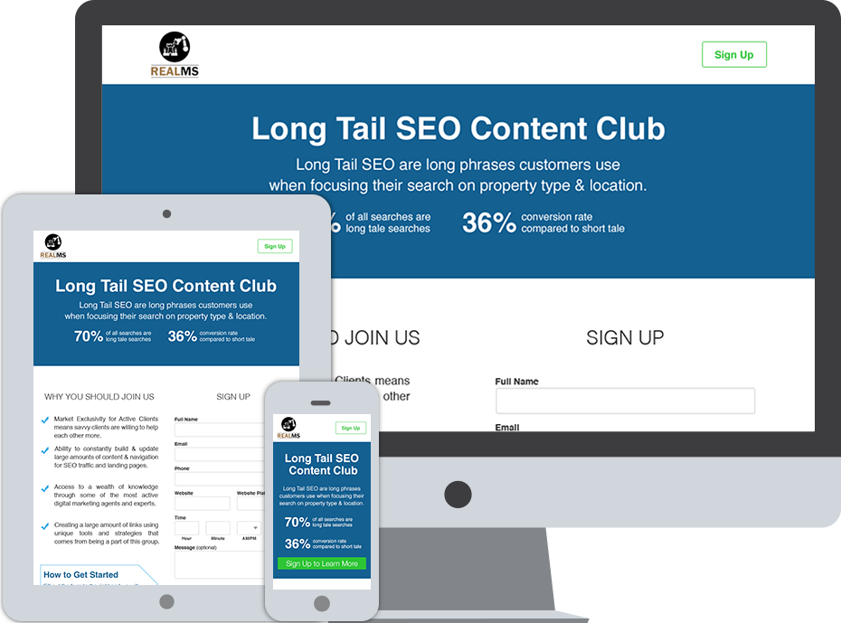
MS REAL is a relatively small and upcoming real estate based SEO service company. They launched a new landing page along with a targeted html email campaign. Unfortunately they weren’t getting the click through rates on the landing page they had hoped for. After discussions with the owner we realized their content was somewhat confusing, they were lacking a concise call to action and lastly their page was not responsive.
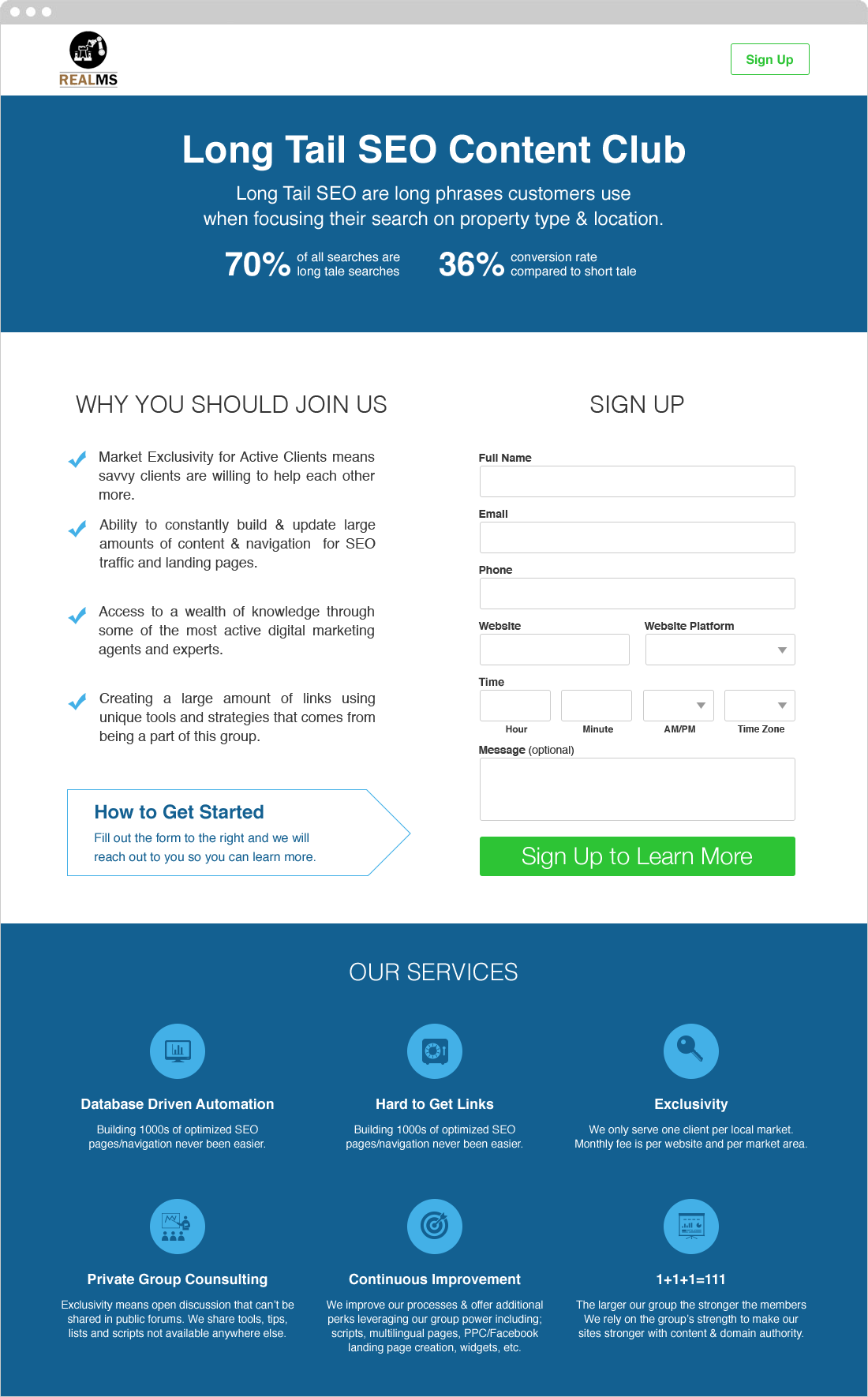
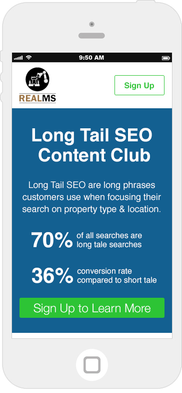
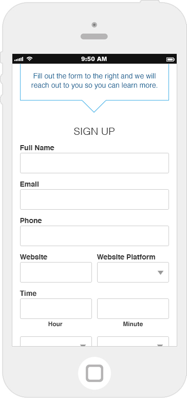
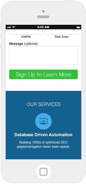
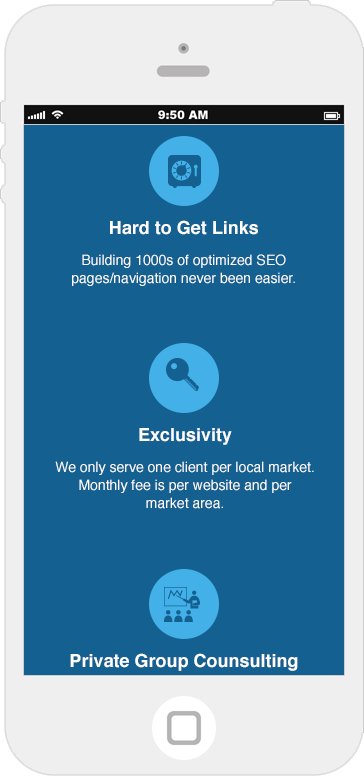
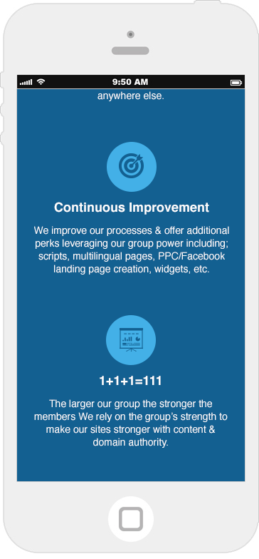
The first thing I did was to really study the copy on the page. I tried to edit the copy where I could. I also added multiple calls to action. The first one I added was a simple “Sign Up” at the top right of the page, this functions as an anchor tag and jumps right to the “Sign Up” form. I also added a “How to Get Started” arrow pointing at the “Sign Up and Learn More” button as a way to reinforce the sign up callout. On the mobile version of the page I added a “Sign Up and earn More” button to hero section, this also functions as an anchor tag, otherwise the user have to scroll too far to see any calls to action. Lastly, I tried to make the “Services” section more visually appealing by adding icons.
Browser View
Mobile Views
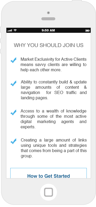
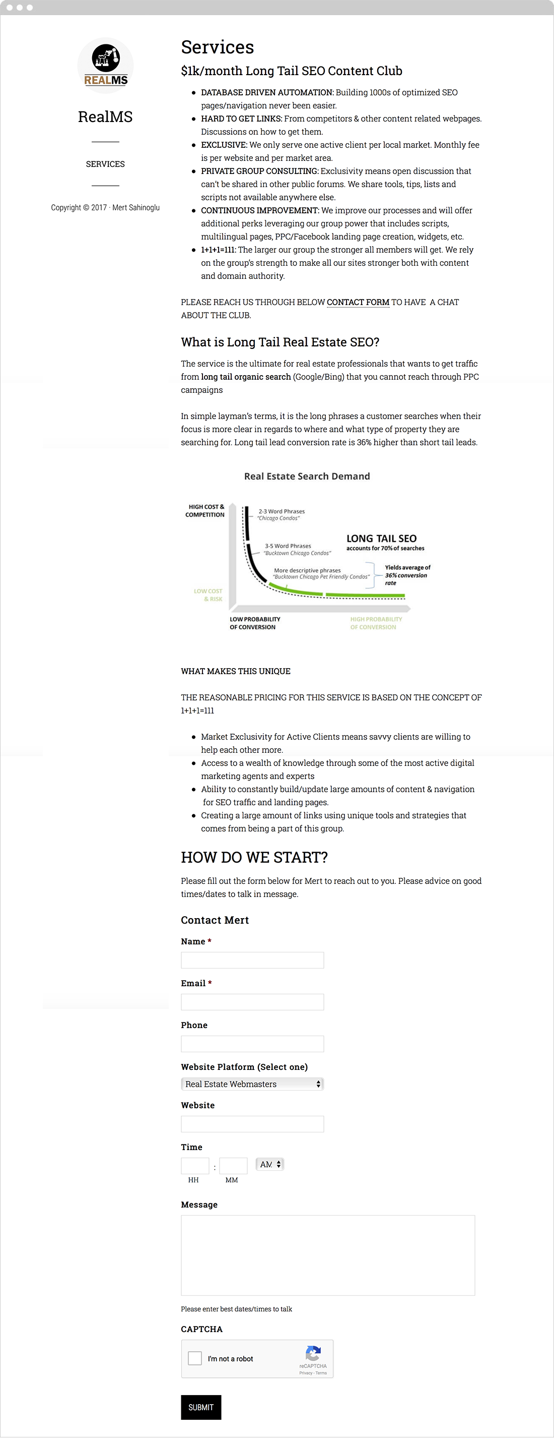
This was the original landing page that supplied the information I used to create my designs.
