
Error Screens
Project Overview
Problem to Solve
Viewpoint is a construction project management software company and like many companies in the construction field several of their applications or screens are a little dated. I was asked by one of the Development directors to come up with a more engaging and easy to use error screen. The current screen lacked a call to action, any real direction and it was difficult for users to know how to report an error to support.
As part of the Viewpoint UX team we have what we UI uplifts. We take different sections or elements of our applications and try to make them easier to use or more visually appealing. I made this error screen a part of this initiative.
Process
Research
The research for this project was pretty simple; Google SAAS Error Pages. I read several articles that helped point out what users need when they encounter an error as well as what not to do. Unfortunately, the current screen was a text book example of what not to do.
Design
I took my new knowledge base and did a couple of quick sketches to get an idea around where to place different elements. It was during this time I had the idea of adding some form fields for the user to be able to submit comments around their error.
Work With Marketing
As mentioned above I used an Illustration from Google as an image placeholder. I always knew we couldn’t use that for the final product, therefore I met with members of the marketing and they designed a final image for me.
Presentation
As part of our UX uplift we are required to present our ideas. I put together a presentation demonstrating examples of what to do and not to do when creating error screens. I also explained how the current screen fell short of expectations. Lastly, as part of the presentation I showed my designs with an explanation of why I chose the direction I did. (The funny illustration was from a Google search and was always meant to be a placeholder, I was playing to my audience.)
Client
Viewpoint
Services
- User Experience Design
- User Interface Design
- Visual Design
Tools
- Sketch
Design Elements
Presentation
New and Improved Error Screens
Original Error Screen
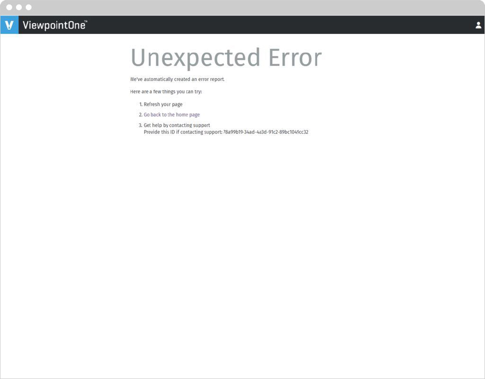
This is the original Viewpoint error screen. It lacked personality and direction. Users were generally confused when they encountered it.
Redesign With No Image
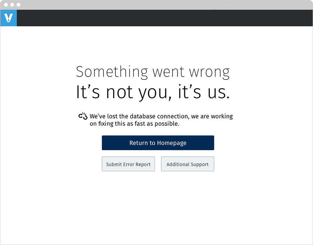
While the rest of my designs had an image, there are some in the company that prefer to keep things straight forward. I wanted to present as many options as possible and I thought this would be a good way to ease people into the ideas.
All designs moving forward show we take responsibility and do not blame the user. There is an attempt to explain what happened. The user has an escape route to return to the home page. They can also either submit a report or request additional assistance.
Redesign With An Image and Two Buttons

This design is almost identical as the other one. However, this design assumed a report was submitted to support on the user’s behalf. It also still allows for additional support as well.
Redesign With An Image and Three Buttons
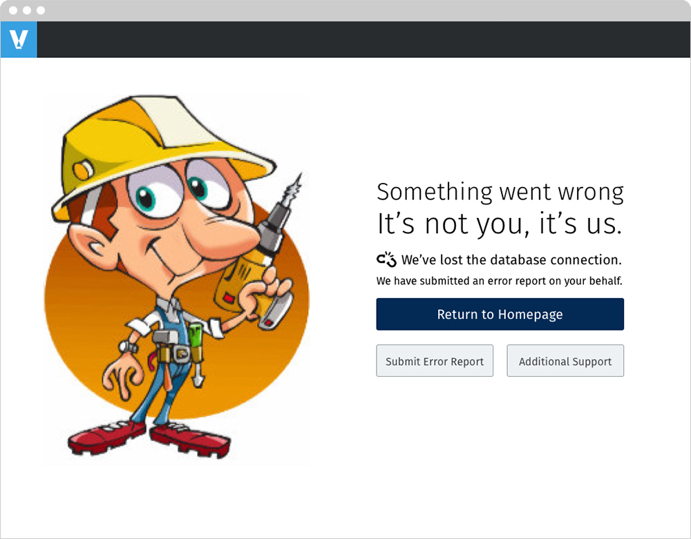
The user has the ability to Submit an Error Report.
Redesign With An Image and Three Buttons Version 2
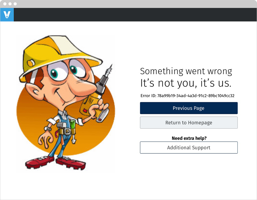
The user can return to the Previous Page, Homepage or get Additional Support.
Support Request
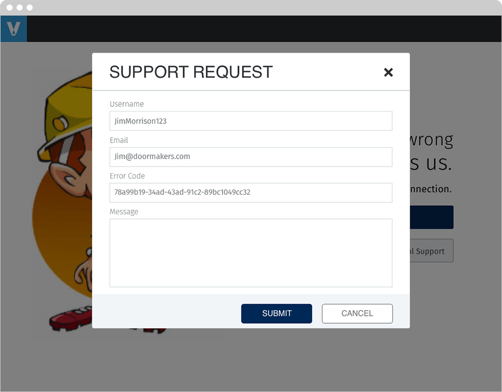
If a user wanted additional support a modal would appear. The modal would be pre populated with the user’s contact info as well as the error number. Lastly, it allows the user add an additional message.
Final Design
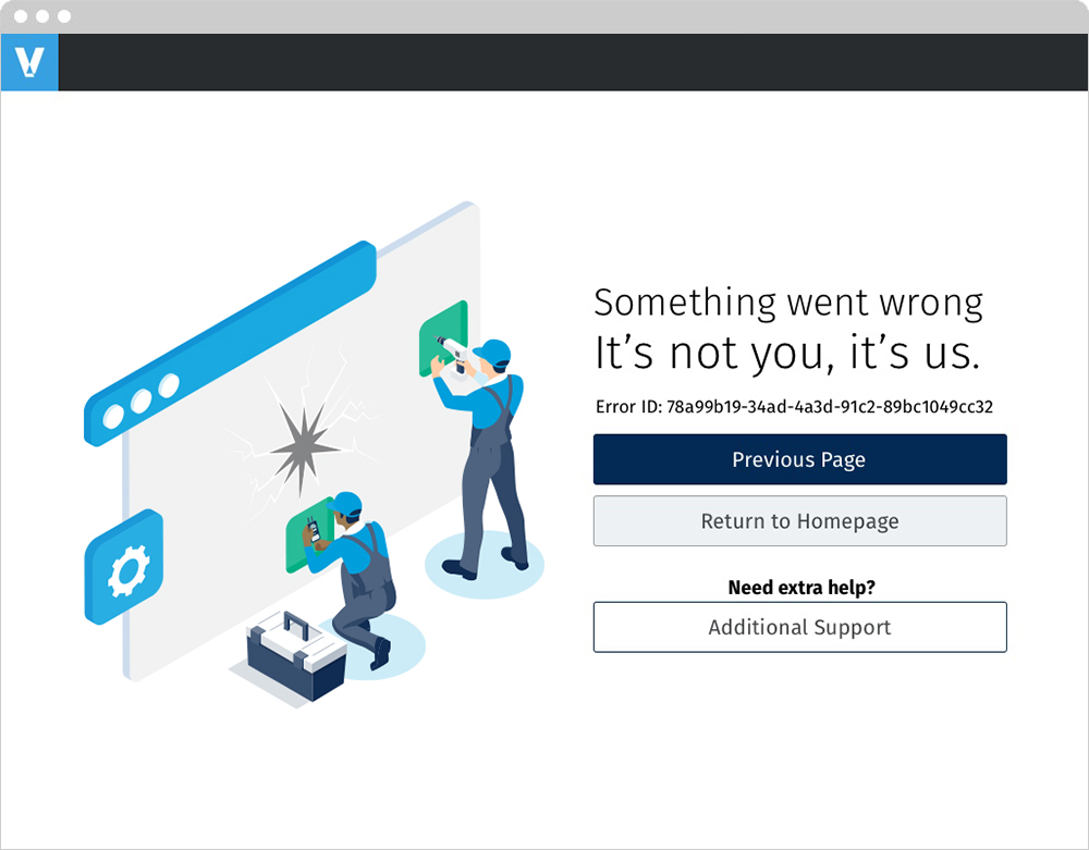
After presenting my designs, some of the feedback I had received was the smaller buttons got lost below the larger one. Also, it was pointed out that returning to the previous screen is an important function. Lastly, it was determined that an error report would be automatically sent on the user’s behalf.
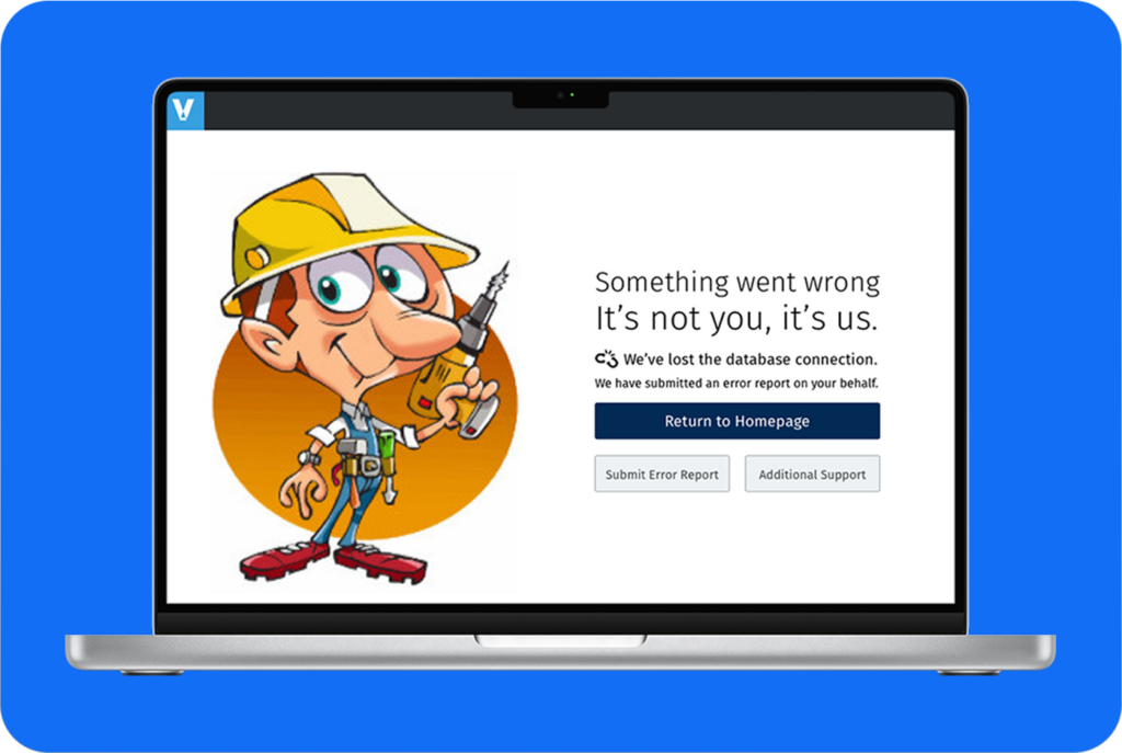
This is the final design using the image marketing created for me.